Sweet Cow Ice Cream
An add-a–feature project that focuses on rotational flavors
Role
UX/UI designer
Timeline
80 hours
Project Overview
Project Goal: Keep customers better informed on rotational flavors.
User: Sweet Cow customers who want to know what flavors are available.
User Problem: Customers are unaware of rotational flavors and end up missing out.
Business Goal: Keep customers well informed and excited for upcoming rotational flavors.
Solution: Add a feature that informs customer about rotational flavors.
Discover
Desk Research
Survey
Comparative Analysis
Define
Personas
Ideate
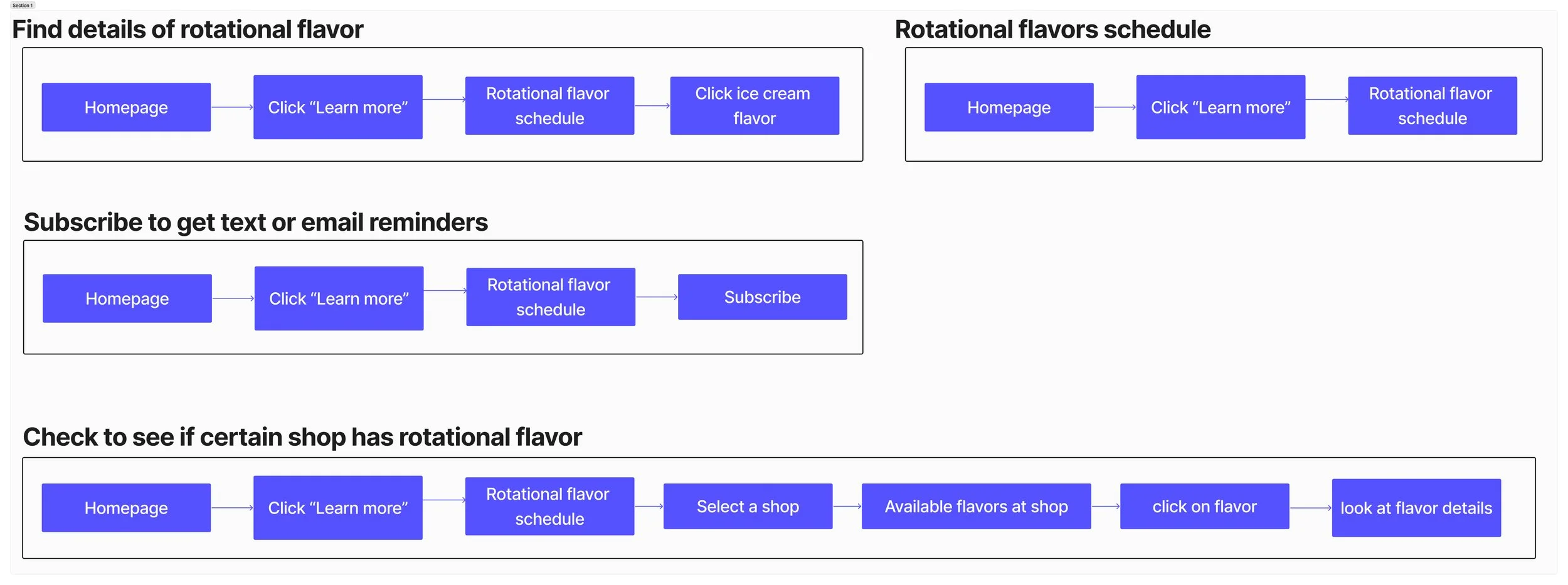
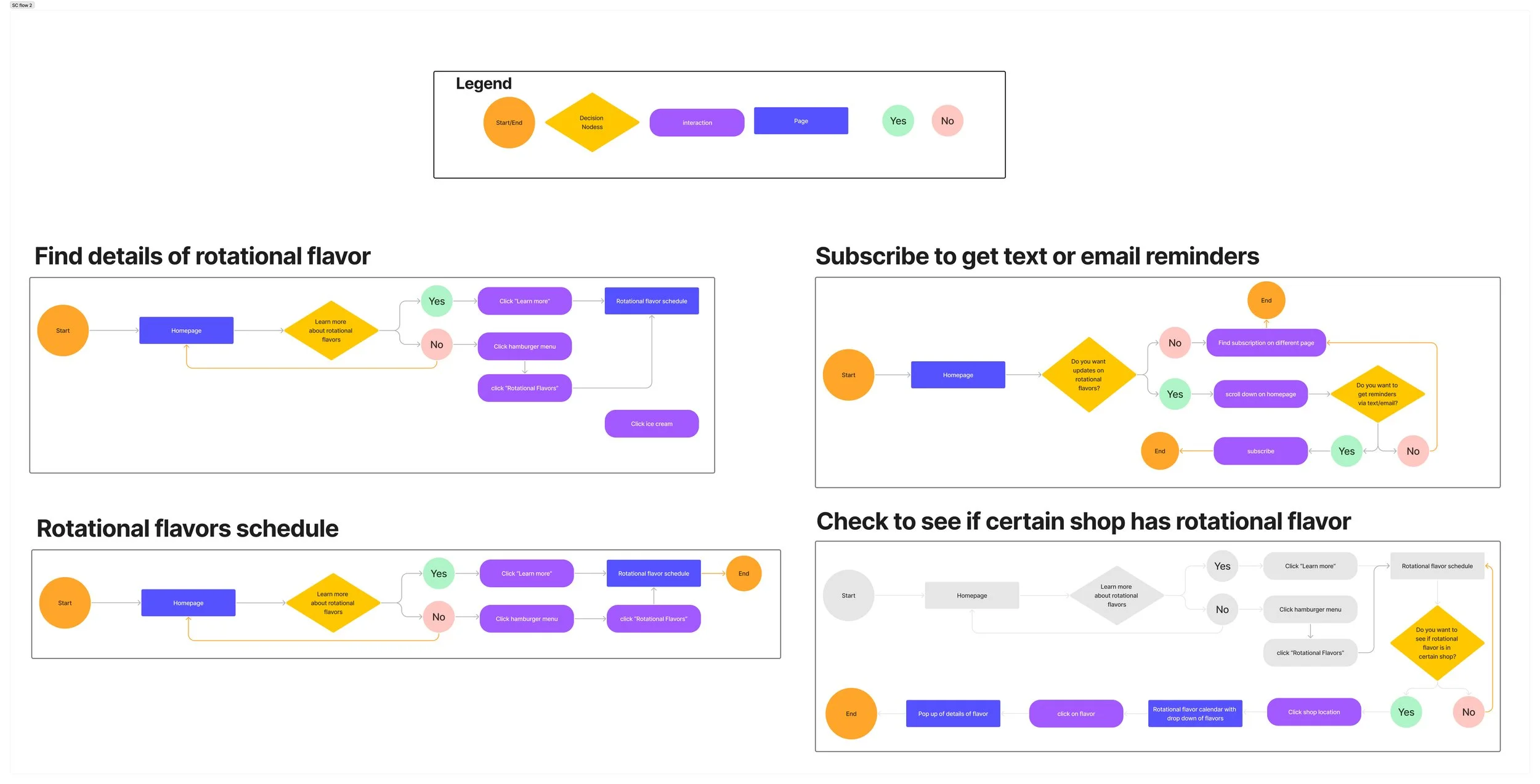
Task Flows
User Flows
Wireframes
Deliver
Prototype
Usability Testing
Analyzing and Prioritizing
Iterations
Research
As a Sweet Cow employee, I conducted a field study to observe our customers' behaviors and preferences, gathering firsthand data through our interactions. This approach provided valuable insights into their needs and frustrations, such as:
Many customers were unaware that Sweet Cow offers both rotational flavors and staple flavors.
Customers often left feeling disappointed when their favorite rotational flavor was not available.
Some customers expressed frustration when employees were unable to provide information about the schedule of rotational flavors.
Employees felt guilty for being unable to inform customers about when certain rotational flavors would be back in stock.
Survey
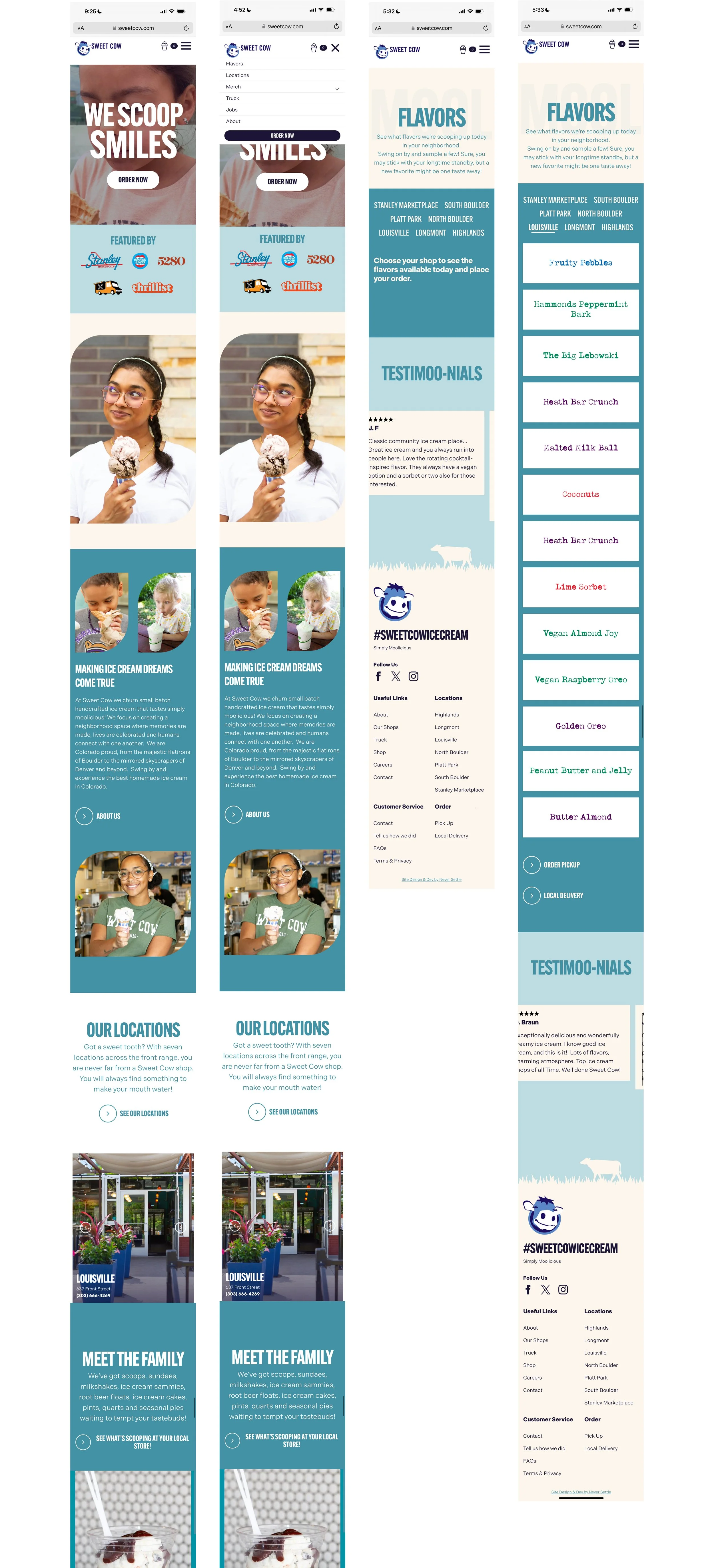
After noting these frustrations, I found that the Sweet Cow website lacks a clear indication of the difference between rotational and staple flavors, with the only mention in the FAQ section. This prompted me to initiate a survey to gather feedback on the website, aiming to identify opportunities for improvement to help address customer concerns.
I sent out a survey to 10 participants with the link to Sweet Cow and asked them:
What do you like about the website?
What don’t you like about the website?
What feature would you want to see on the website?
Why would you go on an ice cream website in the first place?
Findings
All of the participants said they would go on the website to find some kind of information (prices, flavors, about company, and locations).
Participants wanted to add a feature that provided more or clearer information about flavors.
Participants didn’t know which flavors were rotational, staples, or seasonal.
Survey Findings
Comparative Analysis
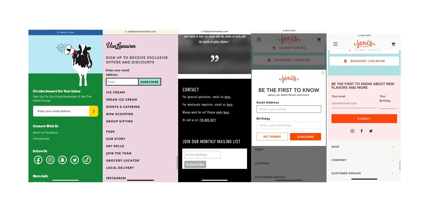
The survey revealed that people are primarily interested in information pertaining to flavors, pricing, location, and company details. This led me to conduct a comparative analysis of four other ice cream shop websites to see what information they offered.
Ben & Jerry’s
Van Leeuwen
High Point Creamery
Jeni’s Splendid Ice Cream
Most websites had flavors on the homepage for easy access and the "showing all _ results" note. This could address complaints about endless scrolling on the Sweet Cow website.
All the other ice cream shops had a subscription option, except Sweet Cow. Adding this feature could keep customers engaged and informed, especially given Sweet Cow's rotating flavors.
Some of the websites highlighted the rotational flavors which could attract customers seeking unique or seasonal offerings, enhancing their experience on the Sweet Cow website
Personas
After analyzing other ice cream websites, I discovered that Sweet Cow did not have a subscription option. Additionally, the absence of clear indications for both staple and rotational flavors confirmed the confusion customers experienced when they visited our shop and couldn't find their favorite rotational flavors on the board. This led me to consider solutions and assisted me in creating two personas.
Task and User flow
Creating user and task flows was crucial in my design process as they helped me understand the user journey, identify pain points, and validate design decisions, ultimately leading to a user-centered design that is intuitive and easy to use.
Creating a task flow was instrumental in mapping out the tasks for my added feature, ensuring its smooth integration with the existing site and avoiding redundancy.
Visualizing how users would interact with the added feature helped streamline the user experience and identify potential pain points.
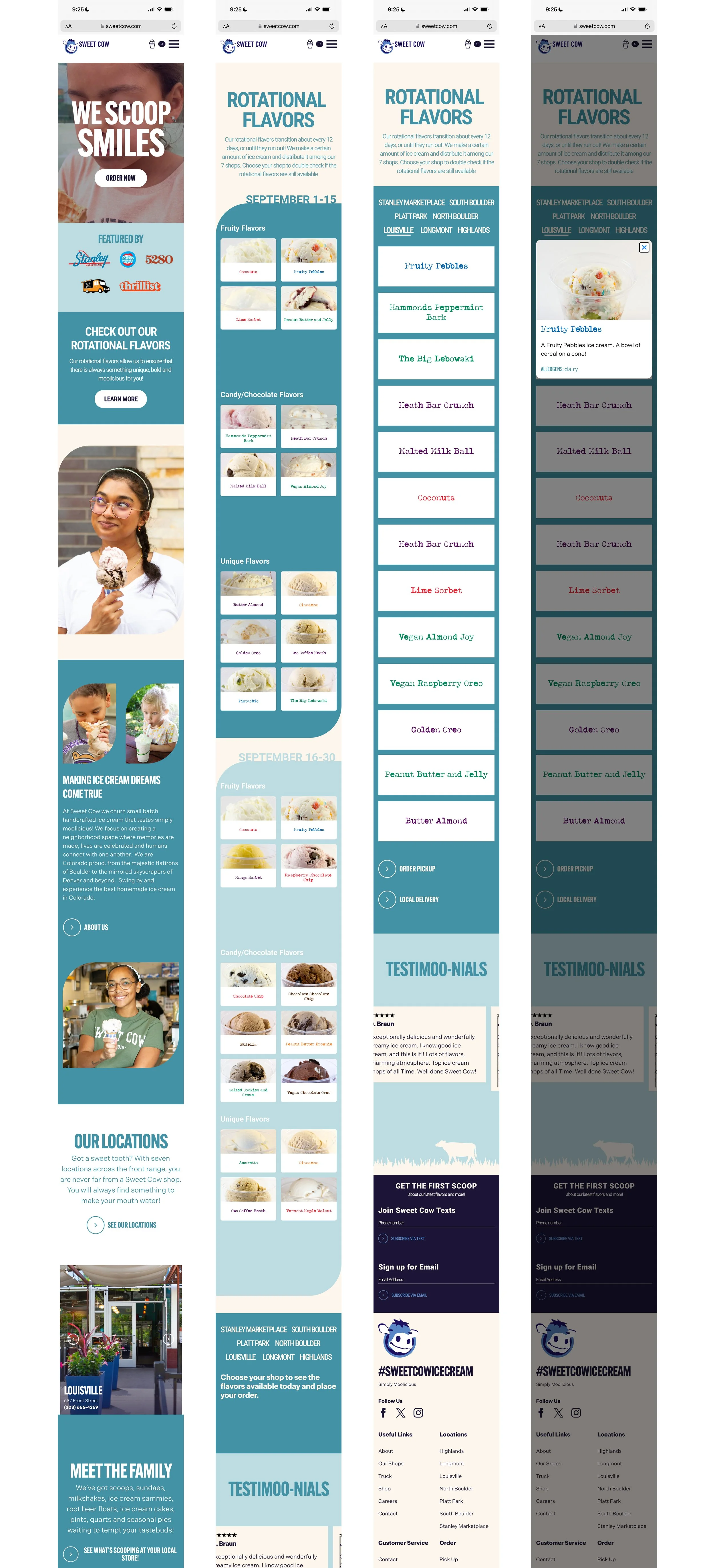
Wireframes
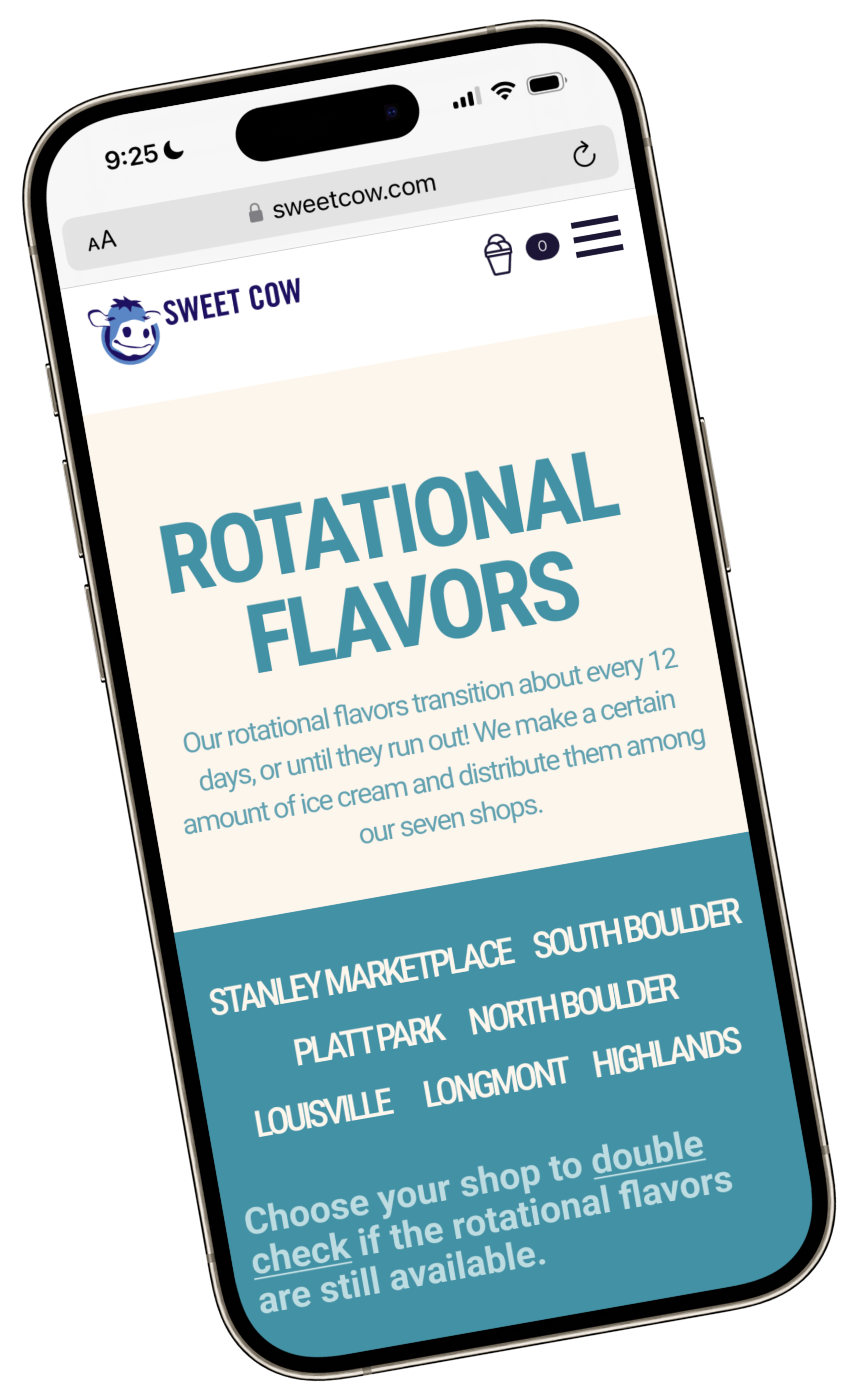
For the wireframes, I collected all the UI components, color palette, and a similar font in order for the added feature to look cohesive with the existing website.
Homepage
Screenshot the entire page and put each section together.
Added the “Rotational Flavor” information below the “ORDER NOW” section.
Included “Rotational Flavor” in the hamburger menu.
Added subscription section at the bottom.
Rotational Flavors Page
Created the bi-weekly sections.
Screenshot the ice cream flavor photos.
Combined ice cream image with label.
Added subscription section at the bottom.
Shops Rotational Flavors Page
Screenshot all the rotational flavors.
Compiled list of flavors on page.
Added Subscription section.
Original Sweet Cow Website
Homepage
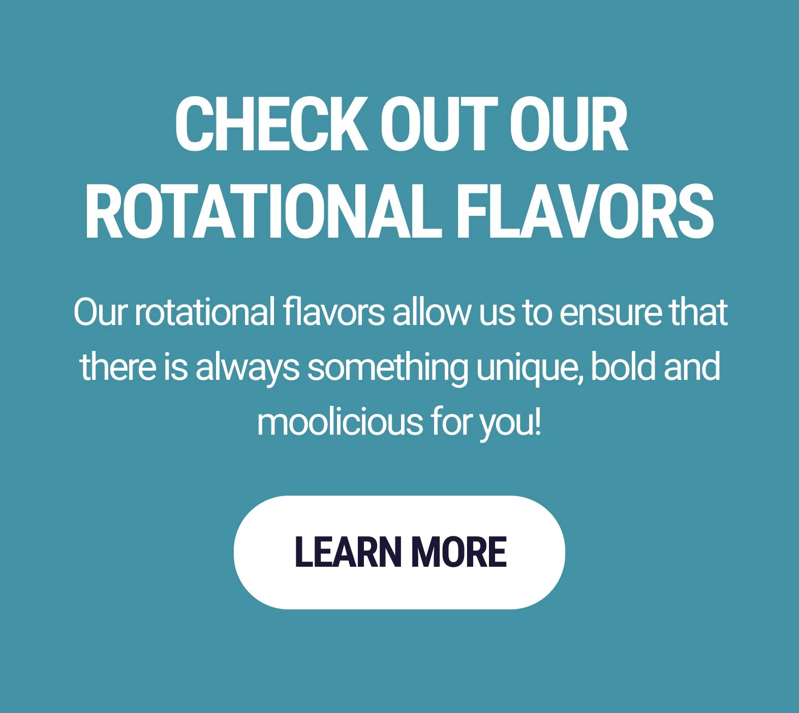
Elevate Rotational Flavors: Featured the new section as the second part on the Homepage.
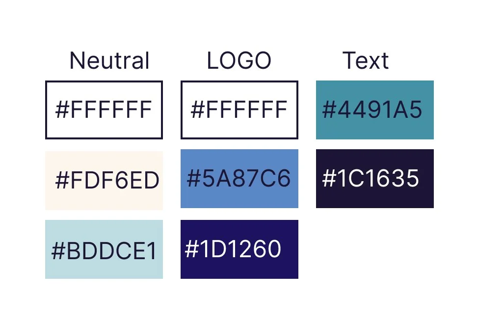
Ensure design coherence: Integrated the same colors.
Maintain design consistency: Replicated the CTA button.
Rotational Flavor Feature
S.C. Color Palette
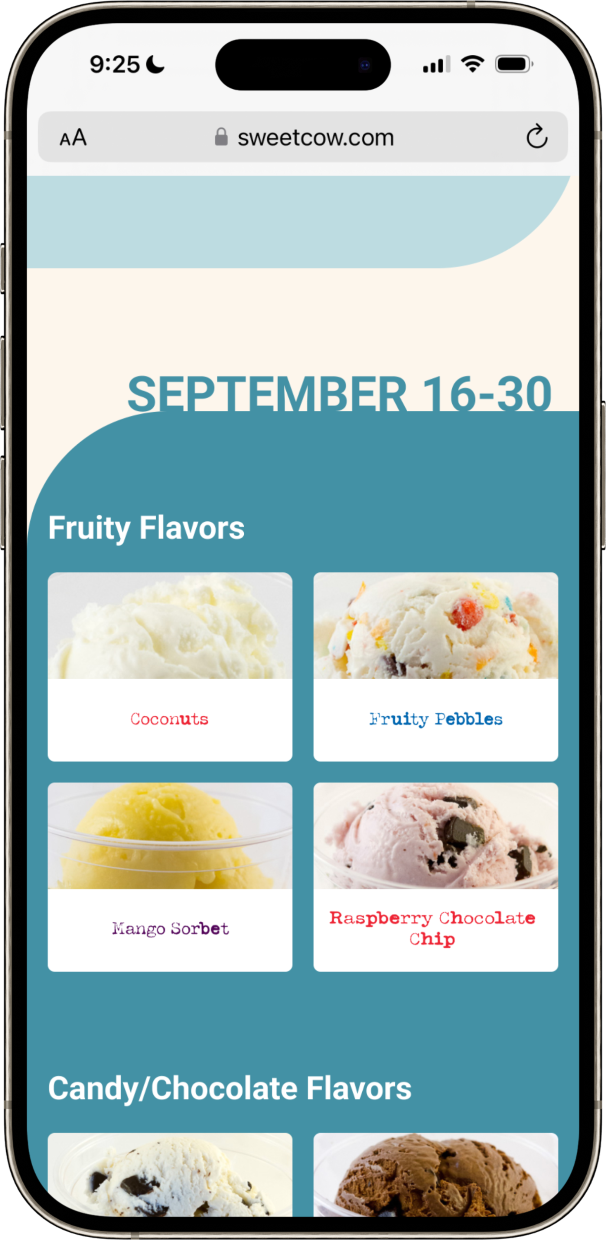
Rotational Flavors Page
Maintain design consistency: Utilized existing color palette.
Ensure a cohesive visual experience for users: Incorporated the same shape as the images to create the bi-weekly sections.
Align with Sweet Cow's design: Integrated their unique font with the ice cream image in the bi-weekly section.
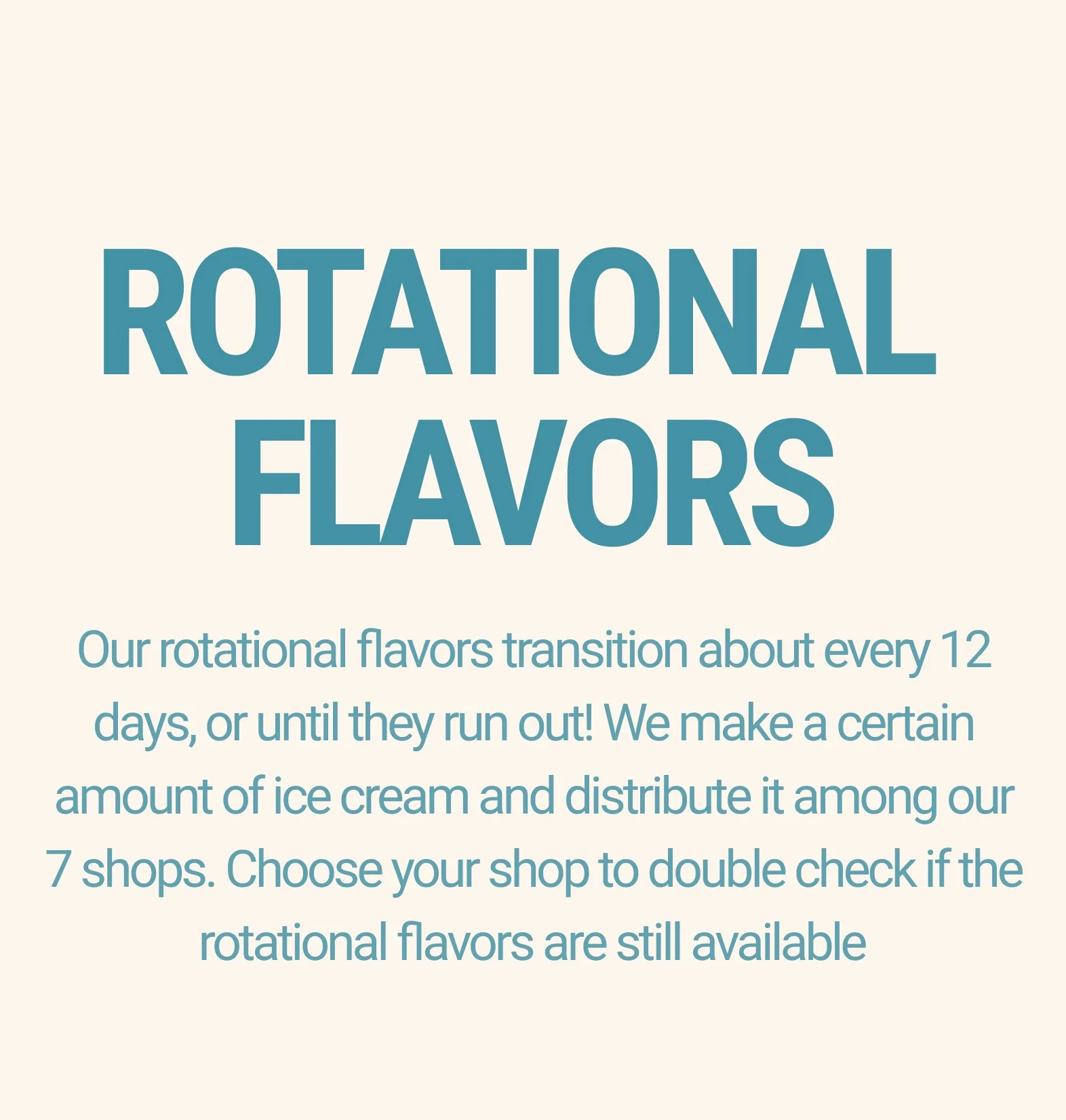
Enhance clarity and differentiation: Included a description of the Rotational Flavors page.
Bi-weekly Flavors Sections
Rotational Flavor
R.F. Description
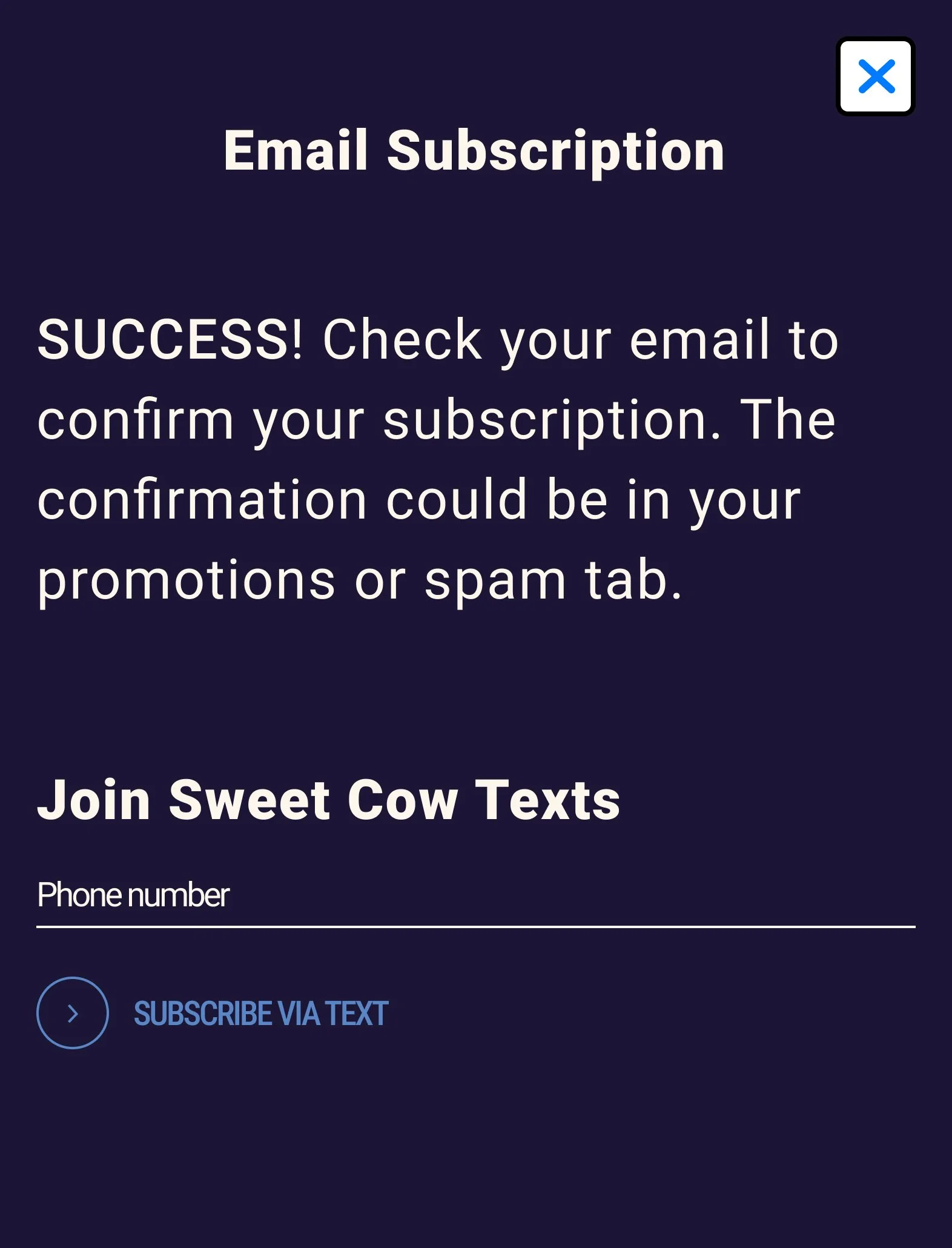
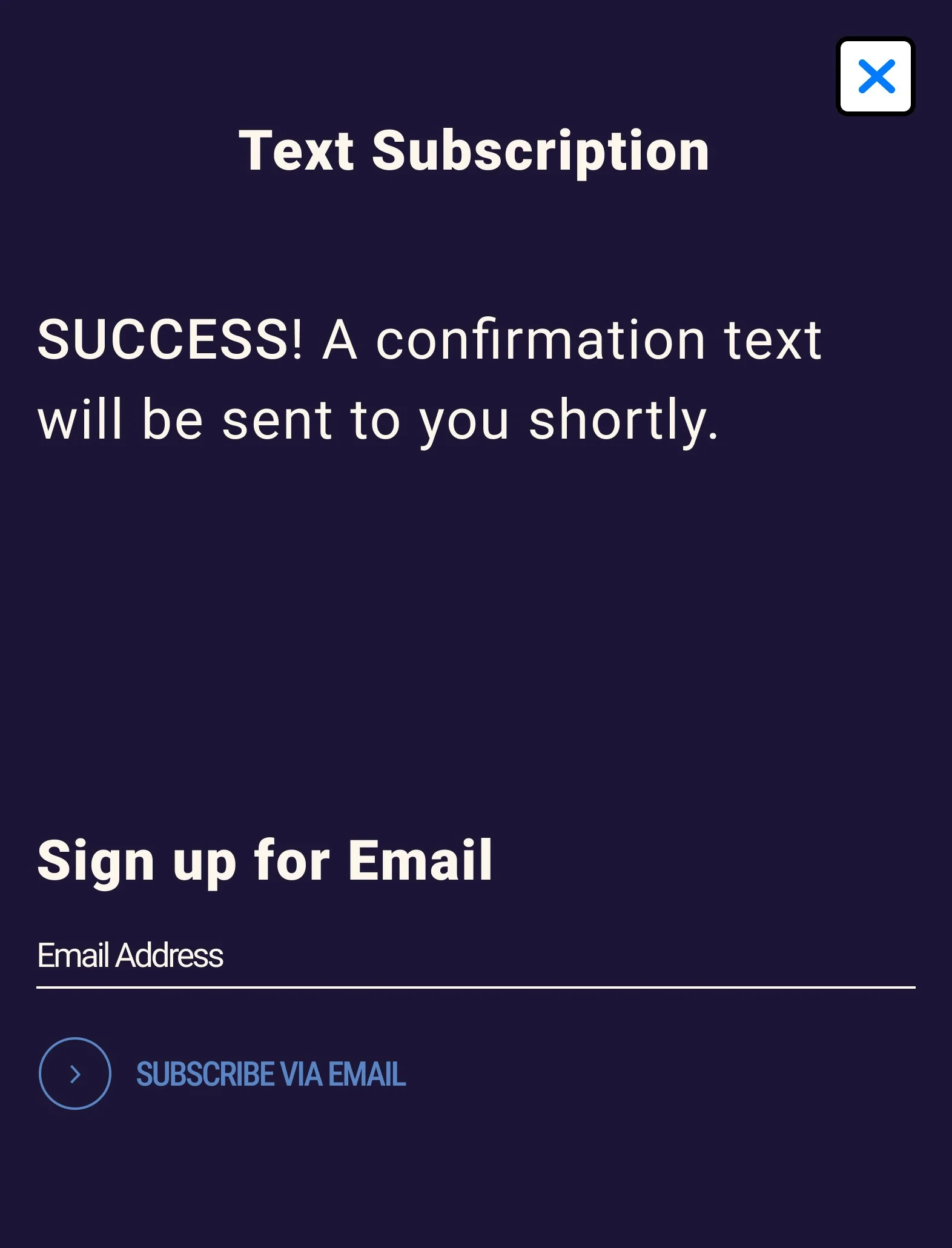
Subscription Section
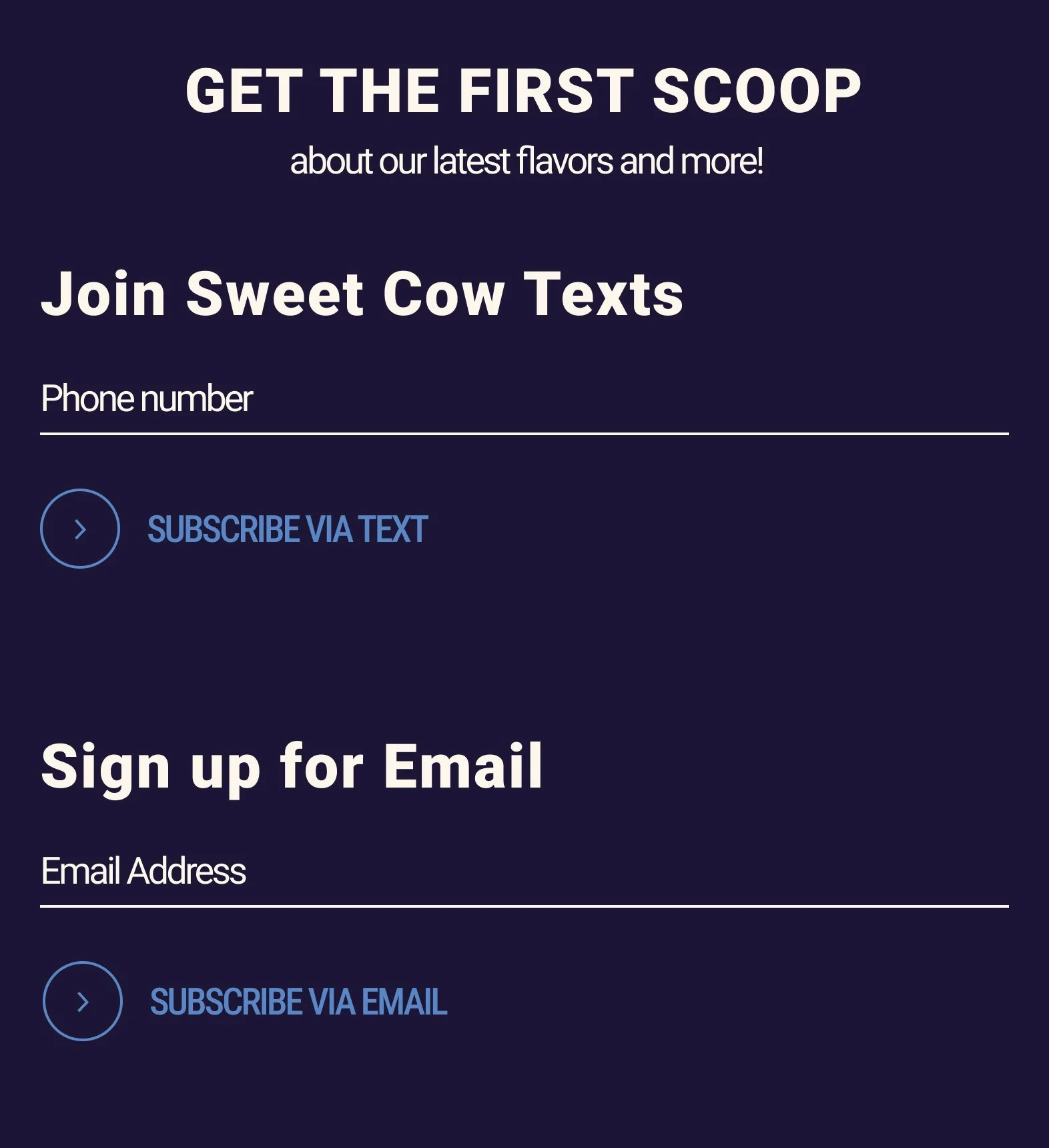
Offer exclusive insight: Implemented a subscription feature.
Enhance customer communication: Provided options to receive updates via email and/or text.
Preserve branding consistency: Utilized existing color scheme.
Subscription Feature
Email Subscription
Text Subscription
Usability Test
Summary
Task 1: Click on CTA to find more information about rotational flavors.
All participants accomplished task.
4/5 participants initially gravitated towards clicking menu bar/ “Order now”.
Task 2: Get more information about Fruity Pebble flavor.
All participants accomplished task.
3/5 participants dislikes the inconsistent spacing of flavors.
Task 3: Check Louisville shop to see if rotational flavor is available.
3/5 participants accomplished task.
All participants complained about finding location.
3/5 participants went back to homepage to look for location.
Task 4: Subscribe to get reminders.
All participants accomplished task.
Sweet Cow Website With Added Feature
Prioritization
After conducting the usability test, I discovered a couple things I would like to change:
Maintain consistency and readability: Adjusted spacing of rotational flavors.
Improve visibility: Moved locations of shops to the top, as participants tended to miss it when it was at the bottom.
Enhance accessibility: Added access to Rotational flavors on the menu bar, considering 4/5 participants gravitated towards tapping the menu bar.
Flavors Sections
Rotational Page
Menu Bar
Feedback
I presented the added feature to my coworkers and asked for their thoughts on the idea:
“I think that's a really good idea to bring attention to our rotational flavors or show that we have special limited-time flavors.”
“Customers would definitely appreciate knowing when we have special flavors available. I think it would add a sense of exclusivity and encourage them to try something new.”
“Having separate sections for rotational and staple flavors would be a smart move. It would feel less overwhelming.”
“Adding this feature would be really useful. It gives customers something to look forward to.”


