Chef’s Kiss
An end-to-end mobile app that connects foodies for fun, discovery, and memories’ sake.
Role
UX/UI Designer
Project Timeline
80 Hours
PROJECT OVERVIEW
Project Goal: Help foodies better document their food adventures and discover new restaurants and recipes to try.
User: People who enjoy documenting their food adventures and want to explore more food content.
User Problem: Foodies want to stay informed on the newest, best places, and try popular foods. They want a platform where the reviews are authentic and trustworthy.
Business Goal: Keep foodies informed and engaged on the app.
Solution: Create an app that is informative, trustworthy, and inviting for foodies to document their food and dining experience.
Discover
Interviews
Desk Research
Define
Personas
HMW
Ideate
Sitemap
Wireframes
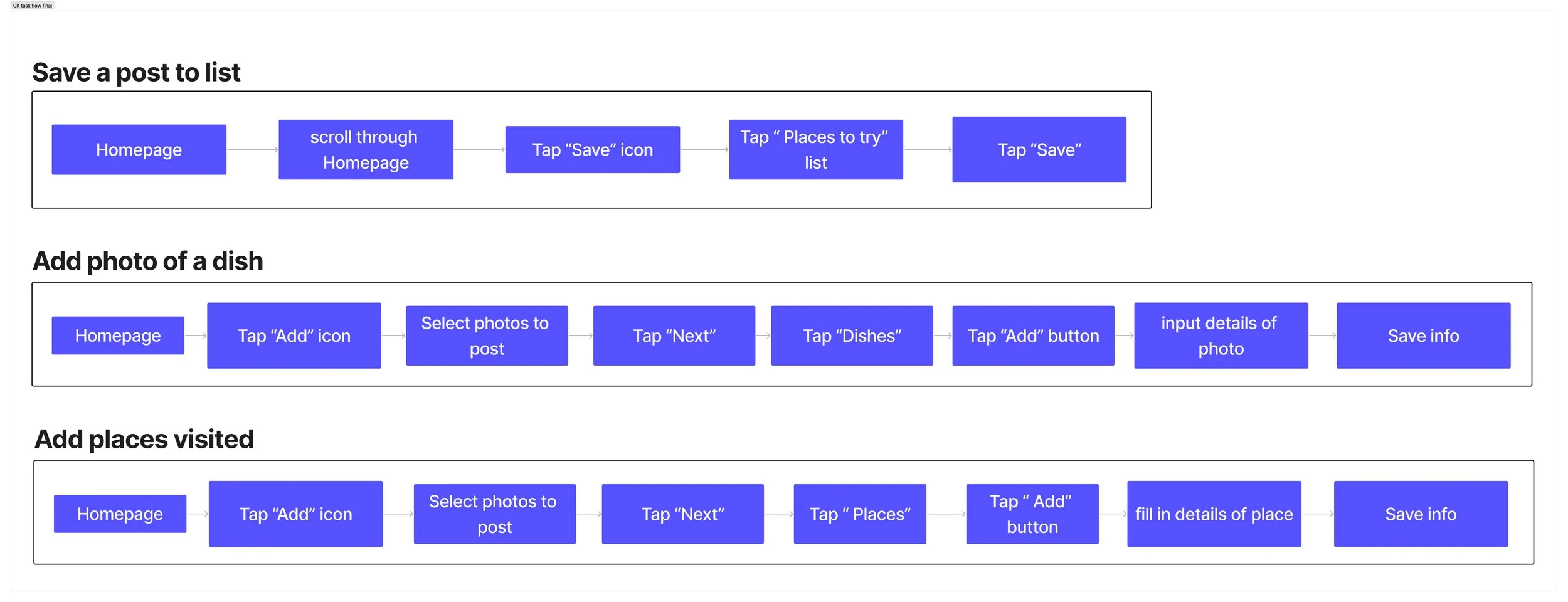
Task Flows
User Flows
Brand Identity
Deliver
Prototype
Usability Testing
Analyzing and Prioritizing
Iterations
Interviews
To delve into the motivations behind food documentation and social media use, I interviewed five participants. My goal was to gain insights, firsthand perspectives, and uncover needs or pain points related to user behaviors and preferences. During these interviews, I focused on understanding:
Why people document their food
If there is a need for connecting through similar interests
What people get out of seeing other peoples food posts
Why people post pictures of food on social media
Different platforms people use to post/see food pictures
“I document for memories sake, to remember how it looks and tastes.”
“I follow similar interest groups to be informed and kept up to date. It’s a nice way for me to discover new places, dishes, and recipes.”
“I enjoy sharing what I am up to, what I am eating, and I enjoy sharing recommendations.”
“I use Instagram, TikTok, Youtube, and Yelp. It’s nice to be able to document my food on instagram, Tiktok and Youtube are good places to watch in depth videos about the food or restaurant, Yelp allows me to see a large volume of photos and reviews.”
Research Findings
From desk research, I learned that Instagram, Tiktok, Facebook, and Mukbang videos are popular platforms for food content. These platforms serve as helpful resources for people looking to discover new restaurants or dishes to try. They are also outlets for people to document for memories’ sake, enjoy food, and help create more business for restaurants.
During the interviews, it was confirmed that Instagram, TikTok, Youtube, and Yelp were the most popular platforms among participants. Understanding their preferences allowed me to conduct a comparative analysis, noting the strengths and weaknesses of each app. Additionally, it provided me with valuable references that will guide my future design decisions.
Instagram: Users like the ability to document food but dislike the lack of authenticity.
TikTok and Youtube: These platforms are praised for food videos and detailed information about food and restaurants.
Yelp: Users appreciate the large volume of photos and reviews, which allows them to see the most popular dishes. However, they would prefer captions on the photos.
Personas
Creating personas was essential for understanding and humanizing users. By assigning them names, faces, and stories, I was able to empathize with their needs and design with their best interests in mind.
HMW Statements
Crafting personas deepened my understanding of users' needs, goals, and challenges, which informed the creation of HMW statements directly addressing these aspects.
These statements helped transform challenges into opportunities and discover actionable solutions in the design process.
HMW help foodies better document their food adventures?
HMW help foodies stay up to date with all the new recipes, restaurants, and food?
Ideate
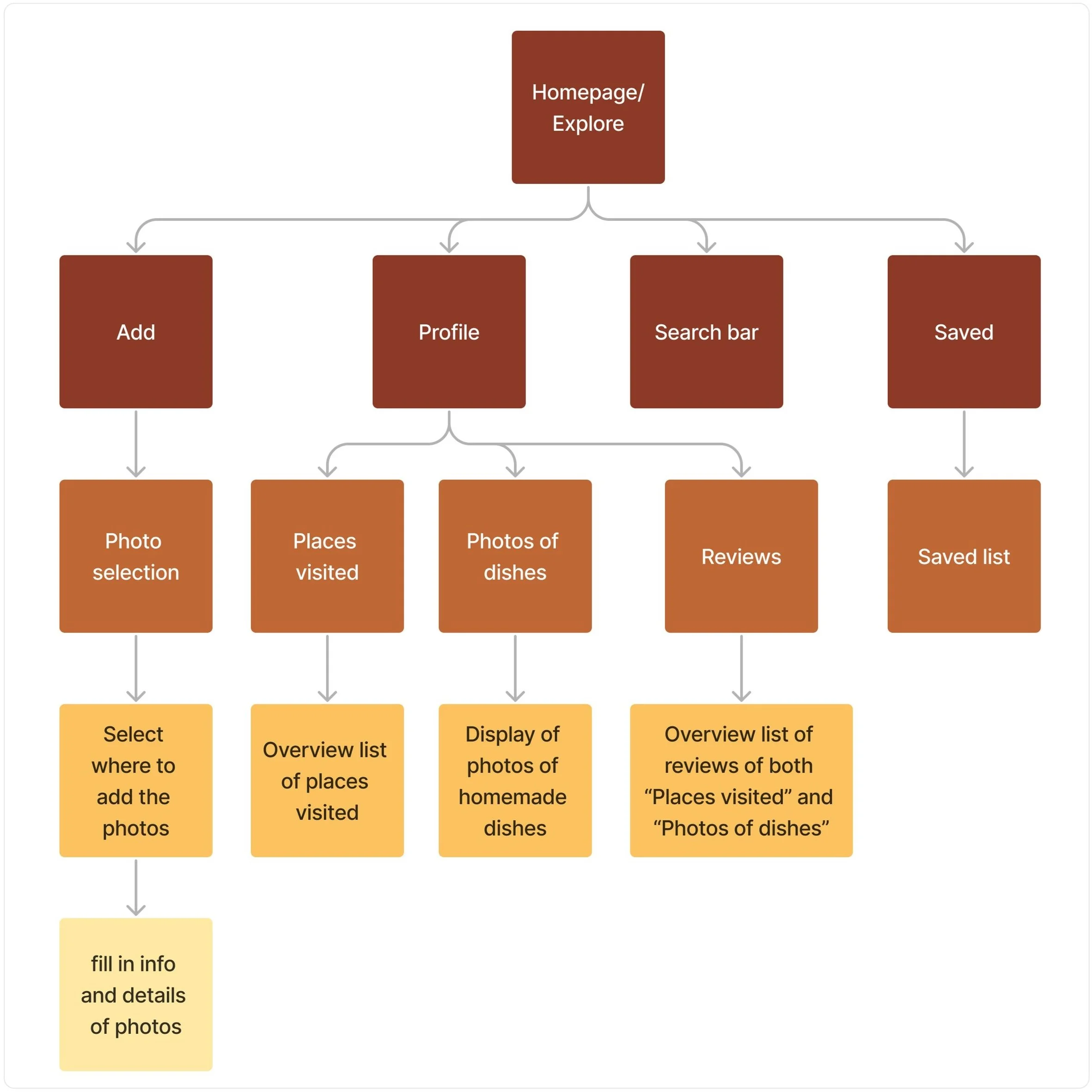
Creating task flows, user flows, and sitemaps was essential for achieving clarity and efficiency in the design process, ultimately contributing to a user-friendly experience.
Task flows helped me identify users' actions and ensure the design met their needs.
User flows mapped out user paths, making the design intuitive by identifying potential issues.
Sitemaps helped me visually organize content, ensuring easy navigation.
Developing the sitemap allowed me to concentrate on the framework of the primary and secondary pages I wanted to include in my app.
Mapping out the task flow helped me identify the key pages and objectives.
With the completion of the sitemap and task flow, I was able to create the user flow. The user flow helped me view my project from a users perspective.
Design
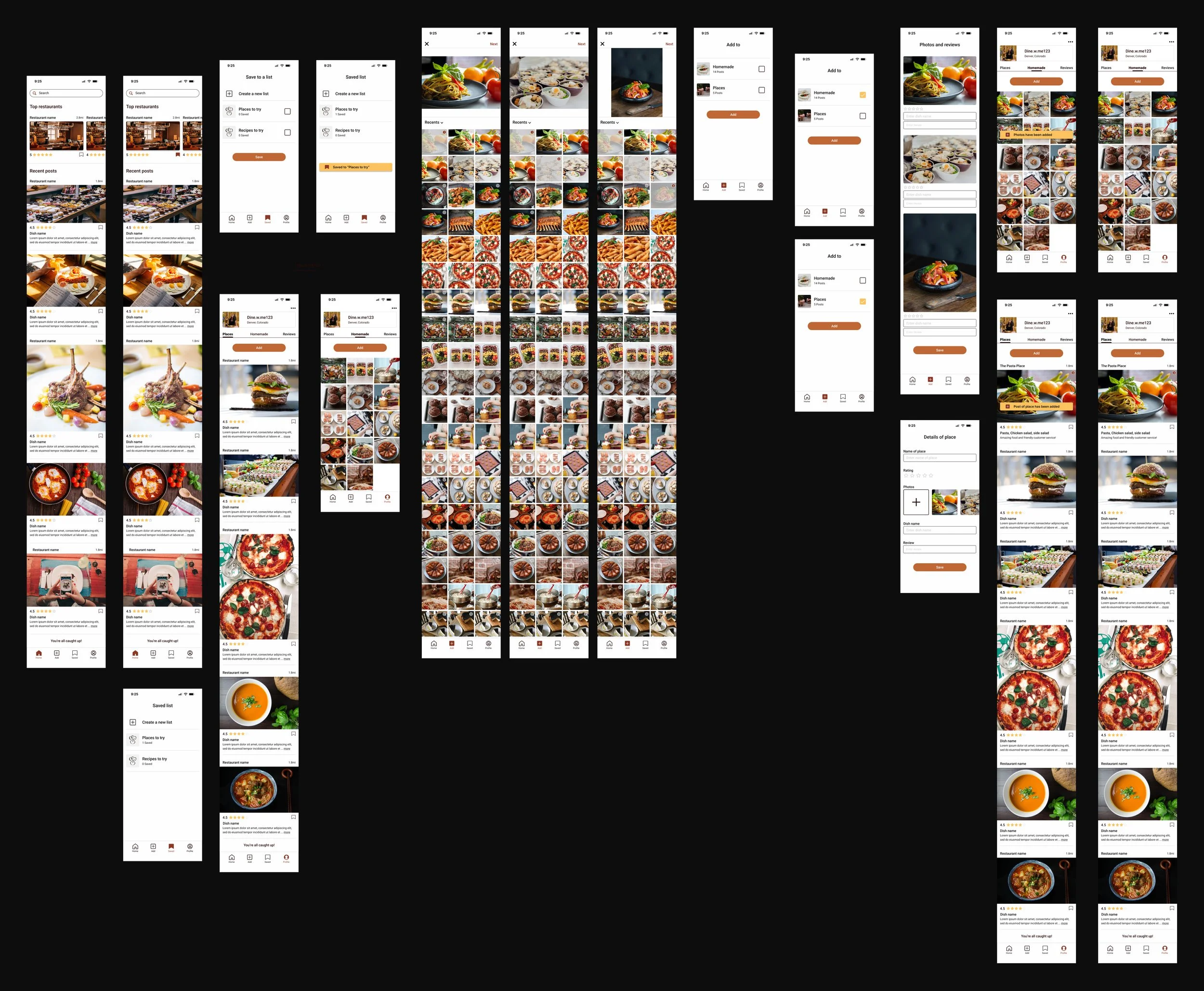
I refined my designs through multiple iterations, starting with sketches and progressing to digital wireframes before finalizing the high-fidelity wireframes. This process provided a solid foundation, ensuring that the final designs were cohesive and well-considered.
Low-Fidelity Wireframe
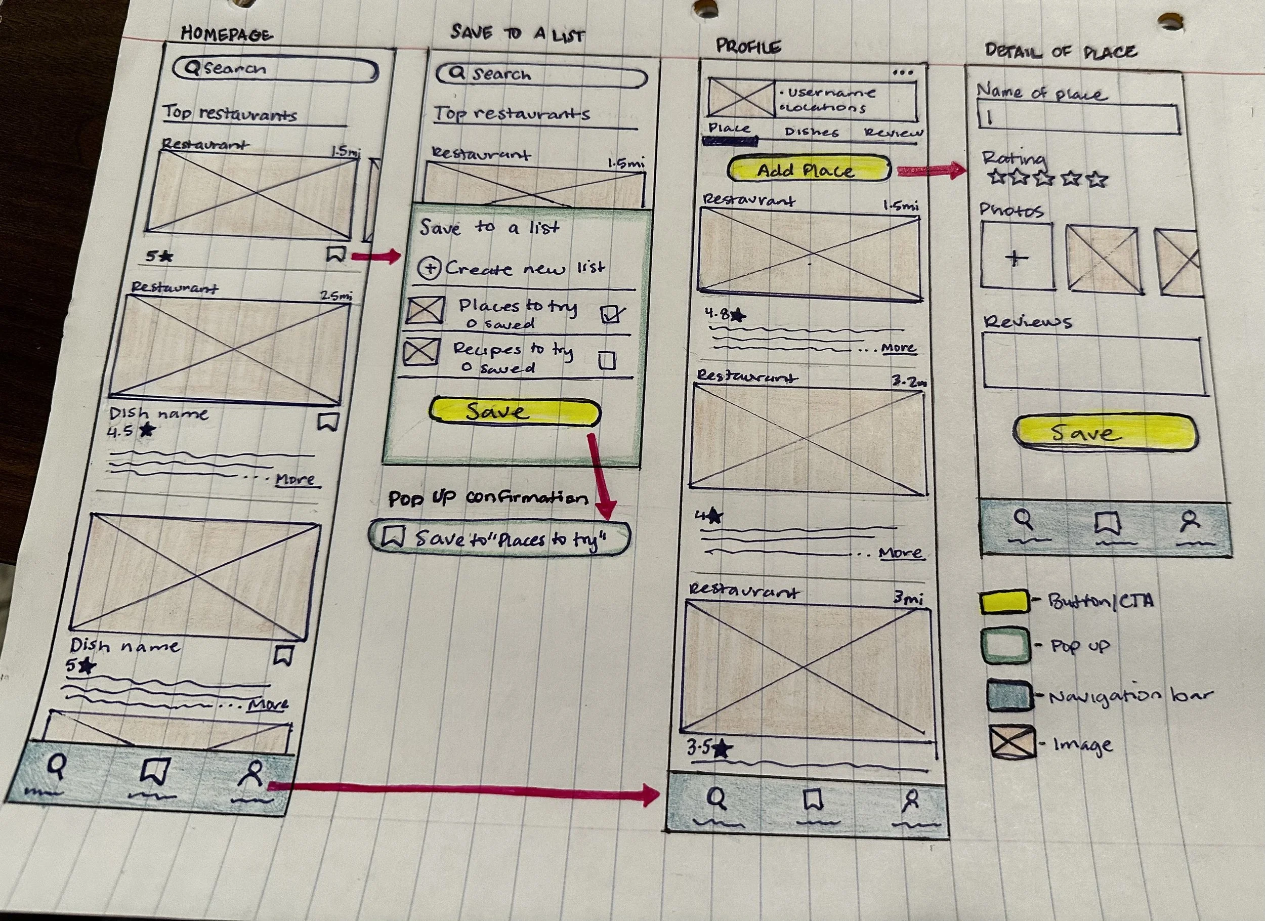
Sketching enabled me to refine ideas quickly and efficiently before investing time in detailed digital designs.
Homepage: Space for users to discover and gather inspiration from top restaurants and food posts.
Save To List Page: Feature that allows users to save places or dishes they want to try.
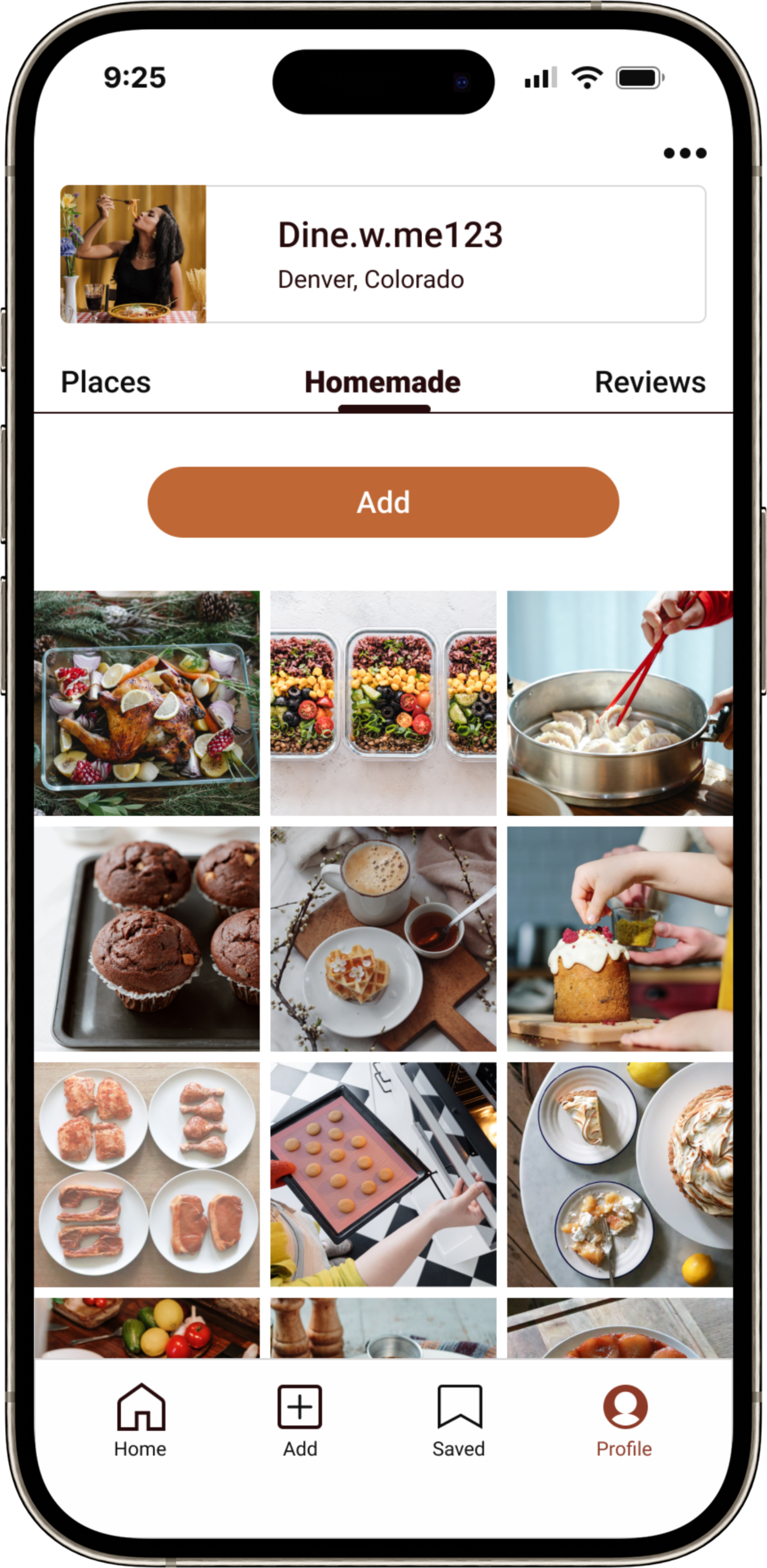
Profile Page: Consolidated area where users can access all their posts and reviews in one place.
Low-Fidelity Wireframe
Digital Wireframe
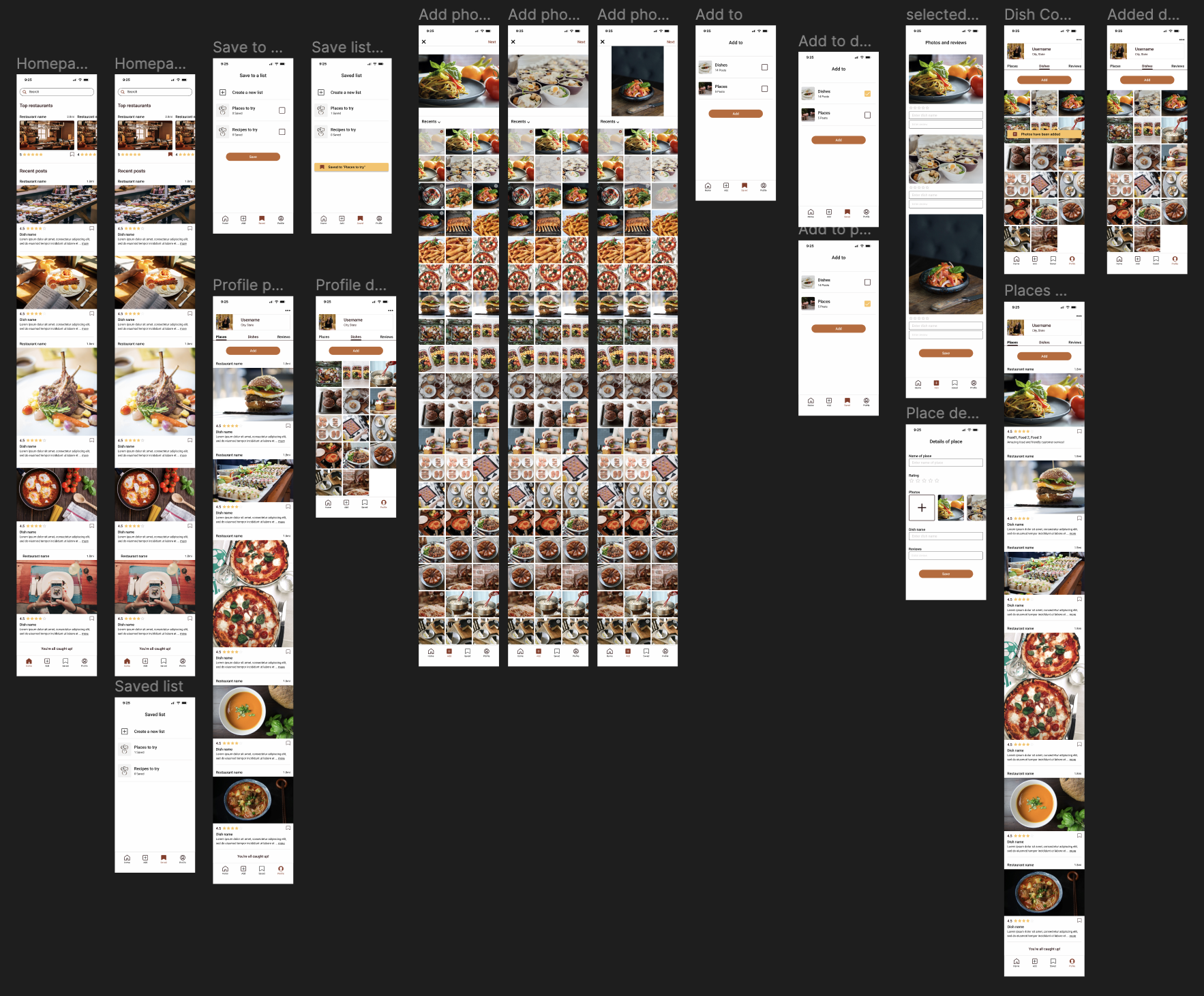
Digitizing my sketches enhances visualization and promotes consistency throughout my design process.
Profile Dishes: Users can browse through their posted Dishes, Places, and Reviews directly on their profile page
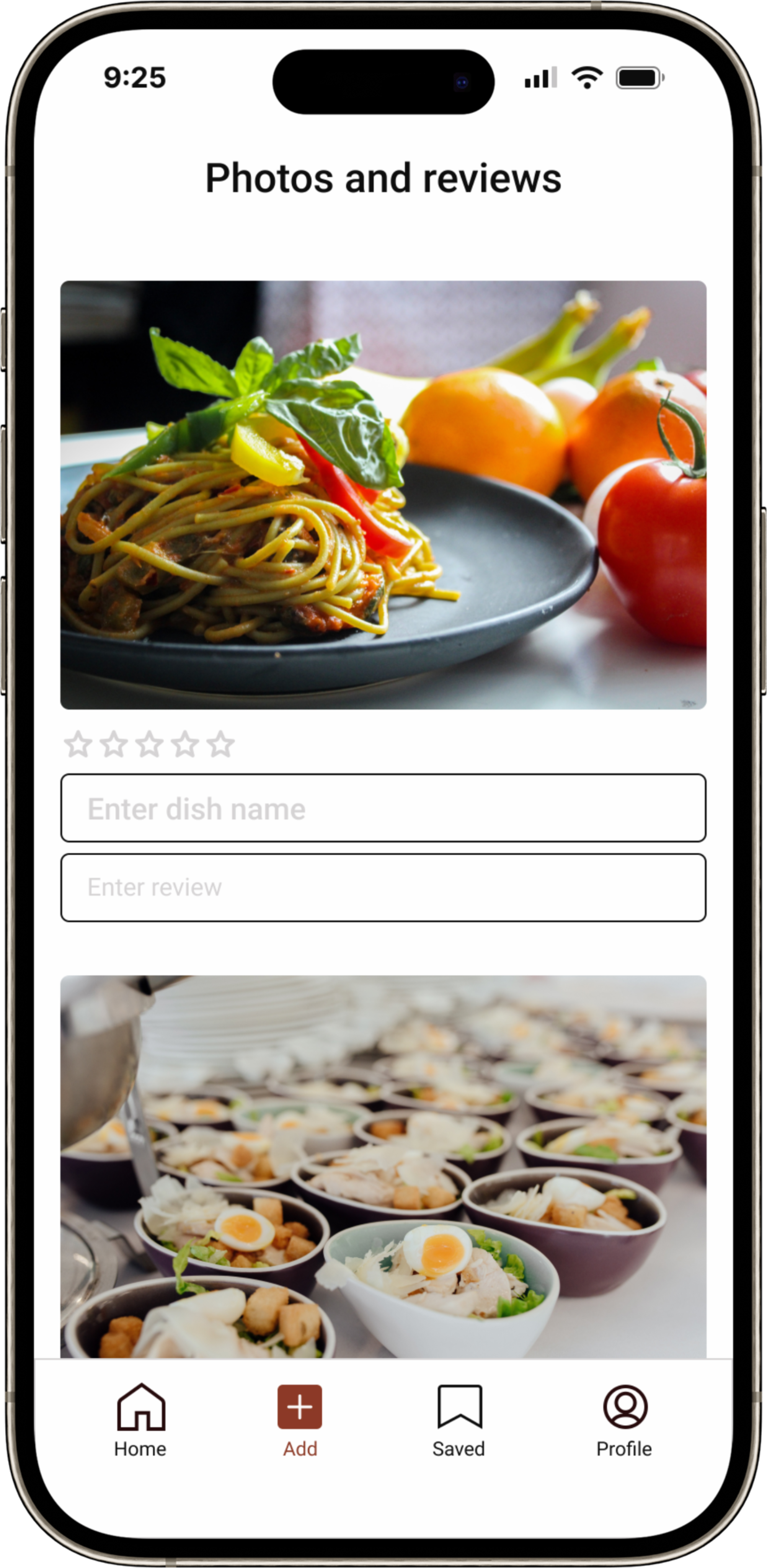
Dishes Post: Similar to Instagram, users can access their albums and select photos to post.
Selected Photos: Following photo selection, users can rate, name, and review the dish they wish to upload.
Digital Wireframe
High-Fidelity wireframes
Creating high-fidelity wireframes enable me to integrate visual design elements, creating a detailed, lifelike representation of the final product.
Navigation Bar: Easily accessible at the bottom, featuring "Homepage," "Add section," "Saved," and "Profile" options.
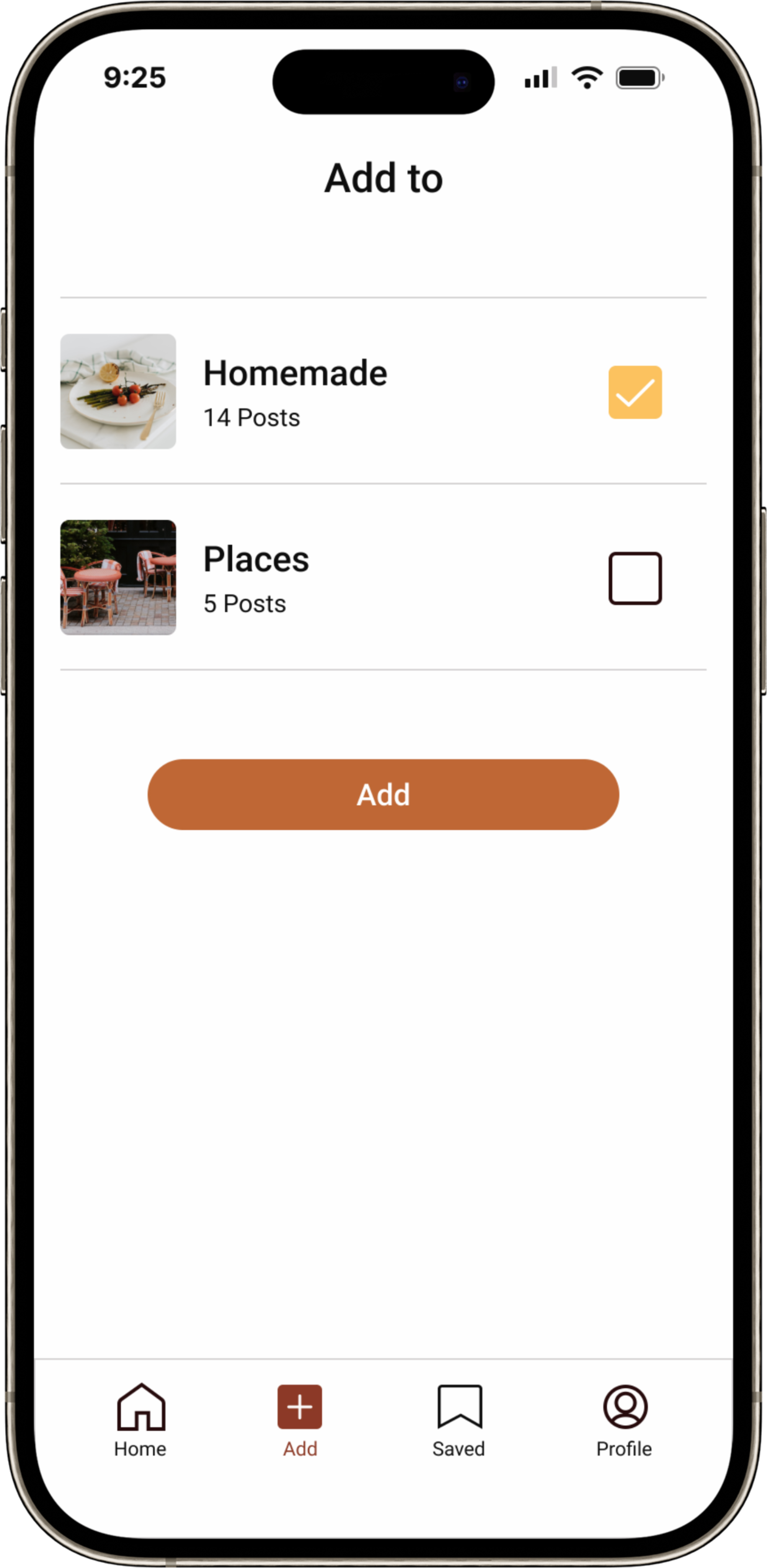
Add to Page: Section where users can choose to upload their content under "Dishes" or "Places."
Detail of Place: Page where users can input name of the place, rating, double-check photo selection, name dishes, and leave a review.
High-Fidelity wireframes
Branding
Chef’s Kiss Logo
I envisioned a lively app for socializing and food appreciation. The logo features a heart resembling a face with a chef's hat, inside of which are the initials 'CK' for "Chef's kiss."
Color Palette and Typography
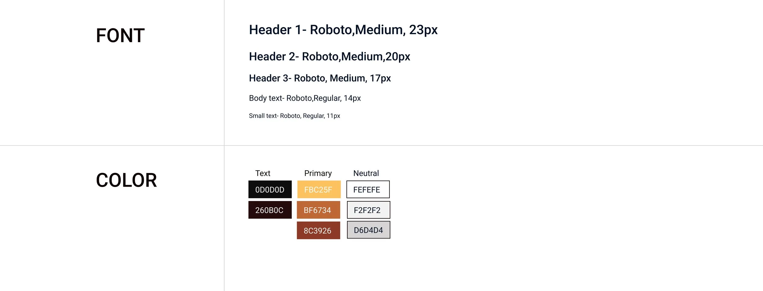
When researching for color inspiration, I observed that many food-related businesses and restaurants used warm hues, particularly shades of yellow and orange.
Yellow and orange: warmth, fun, and inspiration.
Brown: reliability and comfort.
Roboto font: professionalism and straightforwardness.
Icons and Buttons
Universal Icons: Ensure easy and intuitive app navigation for new users.
Prominent Buttons: Designed to occupy most of the screen width and accentuated in the primary color palette to emphasize importance.
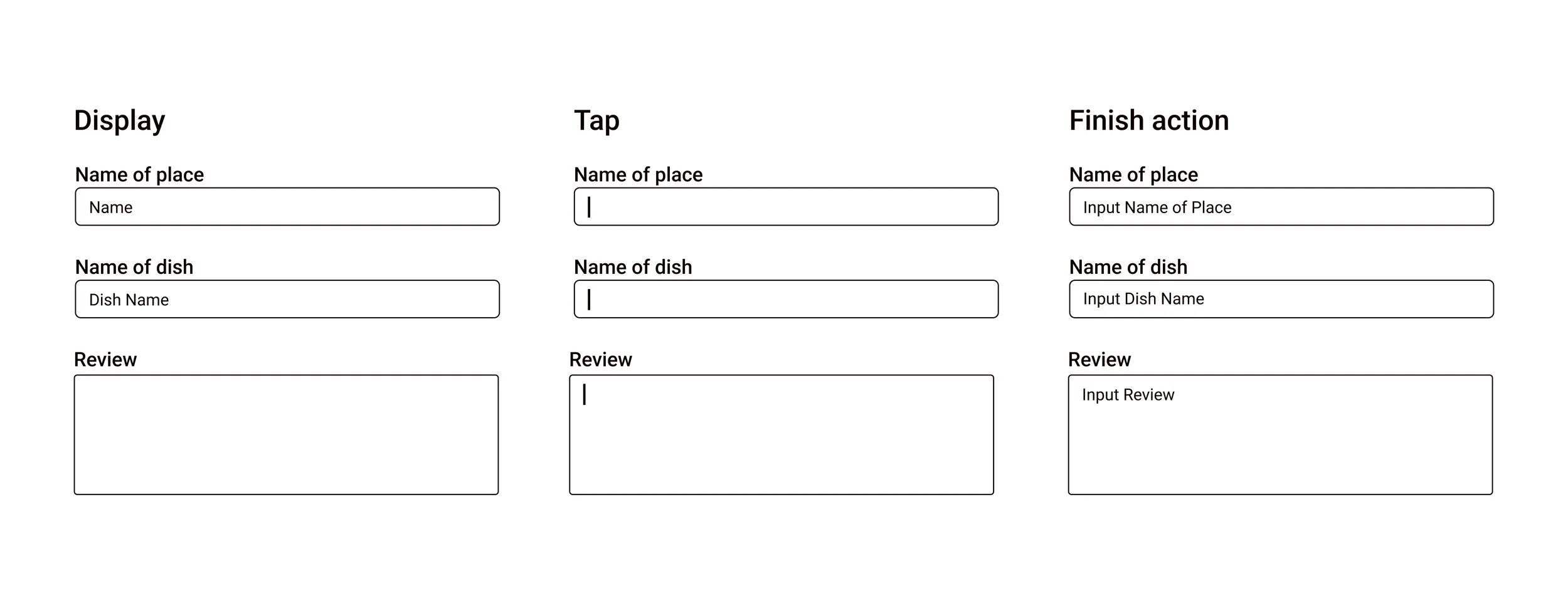
Text Fields
Enhance User Interaction: Implemented functional text fields that provide contextual information, contributing to the overall usability of the interface.
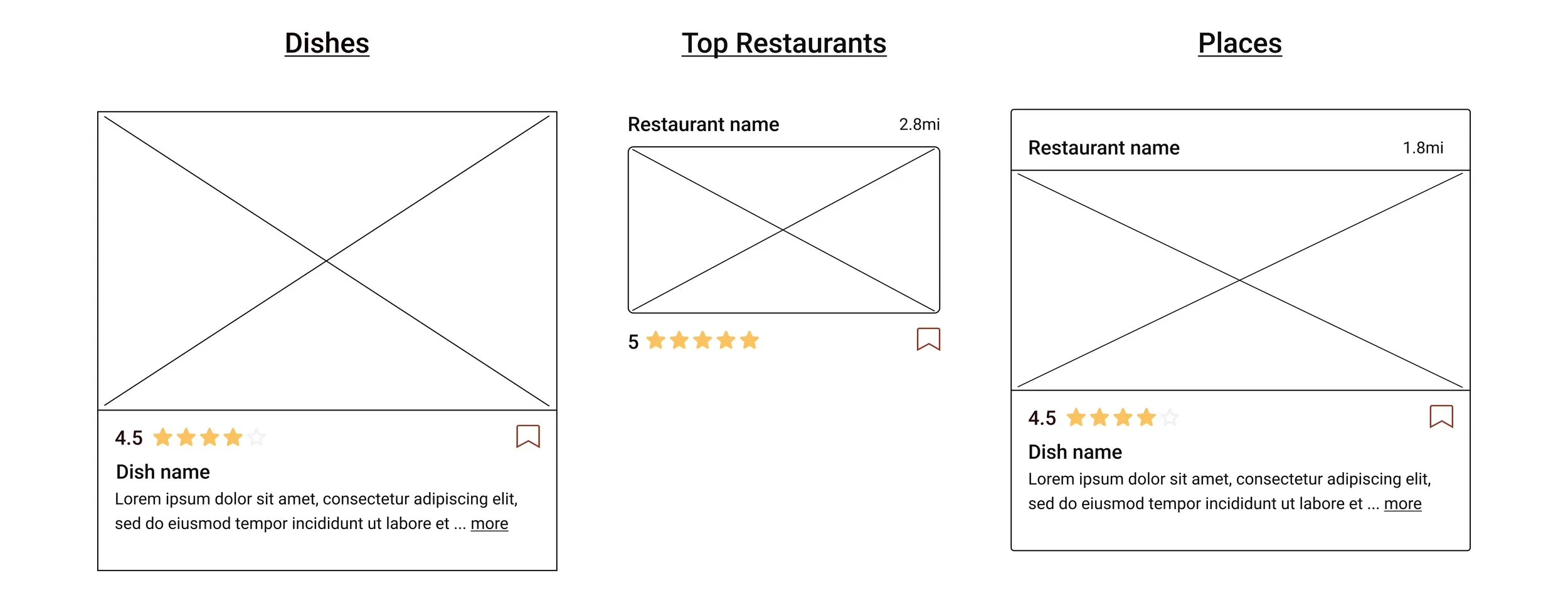
Cards
Consistent Layout: Reviews and a bookmark icon are placed at the top of each card, followed by the dish name and descriptions.
Restaurants and Places: Displayed prominently at the top of each card, the location information includes the name and distance from the user's location.
Usability Test
Summary
Task 1: Have user save a top restaurant to list “Places to try”.
3 participants wanted more interaction such as a section for comments and likes.
⅘ participants clicked on the “Places to try” to double check even though they received a pop up confirmation.
Task 2: Post 3 dish photos.
⅗ participants had issues on the “Add to” page. Checkboxes were activated when they were not supposed to, which added confusion and frustration.
2 participants didn’t like the process of adding photos. 1 didn’t like having to scroll back up to tap “Next” and the other did not like the flow.
Task 3: Make a post for places.
⅘ participants commented on the confirmation pop up. It was unclear that their “Places” post was successful and they thought the location of the pop up was hard to see.
Before Iteration
After Iterations
Prioritization
After conducting the usability test I gathered a couple things I would like to change:
Improve usability: Rectify checkbox issues on the "Add to" page.
Enhance user experience: Implement a confirmation popup for place-related posts.
Streamline interface: Lock the photo display section to reduce scrolling.
Optimize clarity: Replace 'Dishes' with 'Homemade' for clearer labeling.
