Pan Am Airways
A responsive website for Pan Am Airways
Role
UX/UI Designer
Project Timeline
80 Hours
Project Overview
Project Goal: Design a responsive website for Pan Am Airways and refresh their brand.
User: Travelers who book their trips through mobile devices and desktops.
Business Goal: Pan Am wants to make a strong comeback and aims to reach travelers who use all types of devices.
Solution: Create a responsive web design that modernizes the brand and covers the main functionalities: search, booking flights, and online check-in.
Research
Desk Research
Comparitive Analysis
Sitemap
Task Flows
User Flows
Design
Low- Fidelity Wireframe
Digital Wireframe
Hi-Fidelity Wireframe
Branding
Logo Rebranding
Test
Prototype and usability testing
Analyzing and prioritizing results
Iterations
Research
I conducted desk research to find layout inspirations and gain insight into the operations of various airline websites. Major airlines like Delta Airline, United Airlines, and Southwest Airlines were among my focus, along with Virgin Atlantic Airline, which served as a key reference for Pan Am's emulation. Analyzing these airlines equipped me to create a user-friendly and familiar experience for Pan Am, drawing on industry-leading practices and design elements.
Desk Research Findings
Through comparative analysis of different airlines, I identified and incorporated best practices for essential user flows such as booking, check-in, and search. This process helped me select the most relevant categories for the Pan Am website, which enhanced my ability to create a user-friendly and intuitive sitemap, task flow, and user flow.
Sitemap
Featured the three main flows clearly on the homepage for easy access.
Separated departure and return flights onto distinct pages to reduce clutter.
Split contact and payment info on different pages to enhance a streamlined experience.
Pan Am Airways Sitemap
Task flow research findings
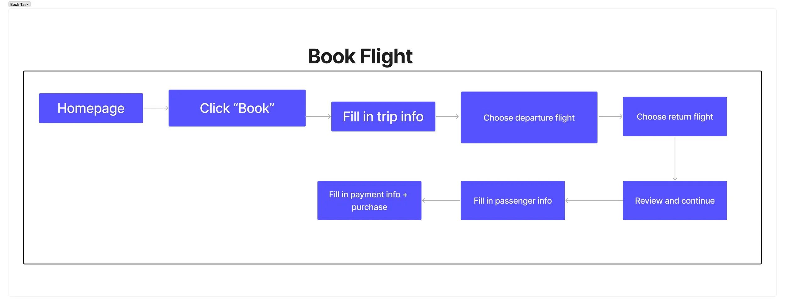
Book Flight
For all airlines, the booking was accessible and located on the homepage with details for users to fill out.
3/4 of the airlines had departure and return flights on different pages.
Half of the airlines contained the summary and payment details on separate pages.
Check-in
All airlines had check-in readily available on the homepage.
Search
All airlines displayed a prominent search icon on the desktop homepage.
All airlines showed “popular topic” suggestions which are a helpful addition for users.
Pan Am Airways Task Flow
User Flow
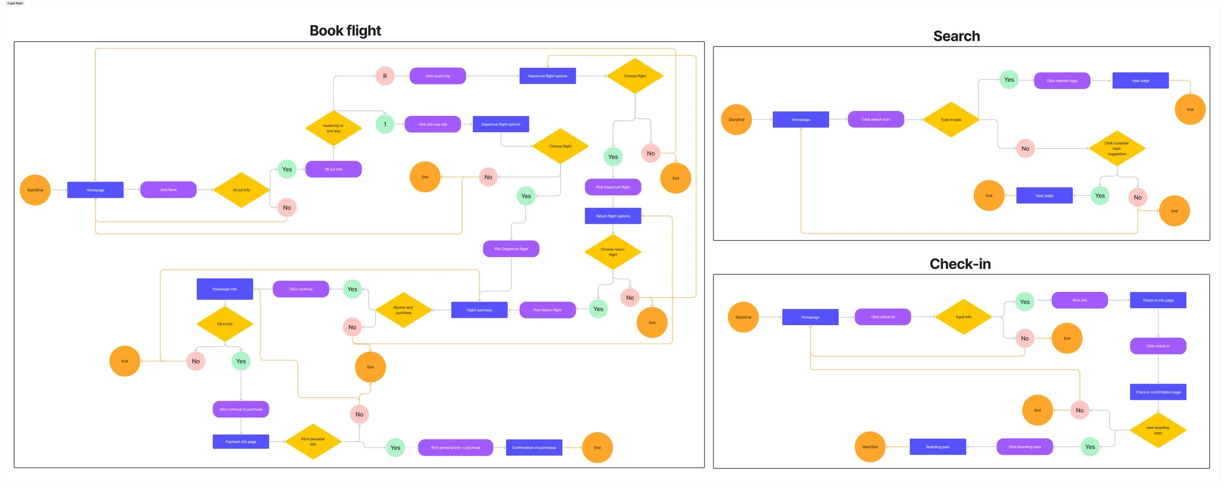
After finalizing the sitemap and task flow, I created the user flow by examining tasks and identifying the choices users faced to accomplish them.
Pan Am Airways User Flow
Design
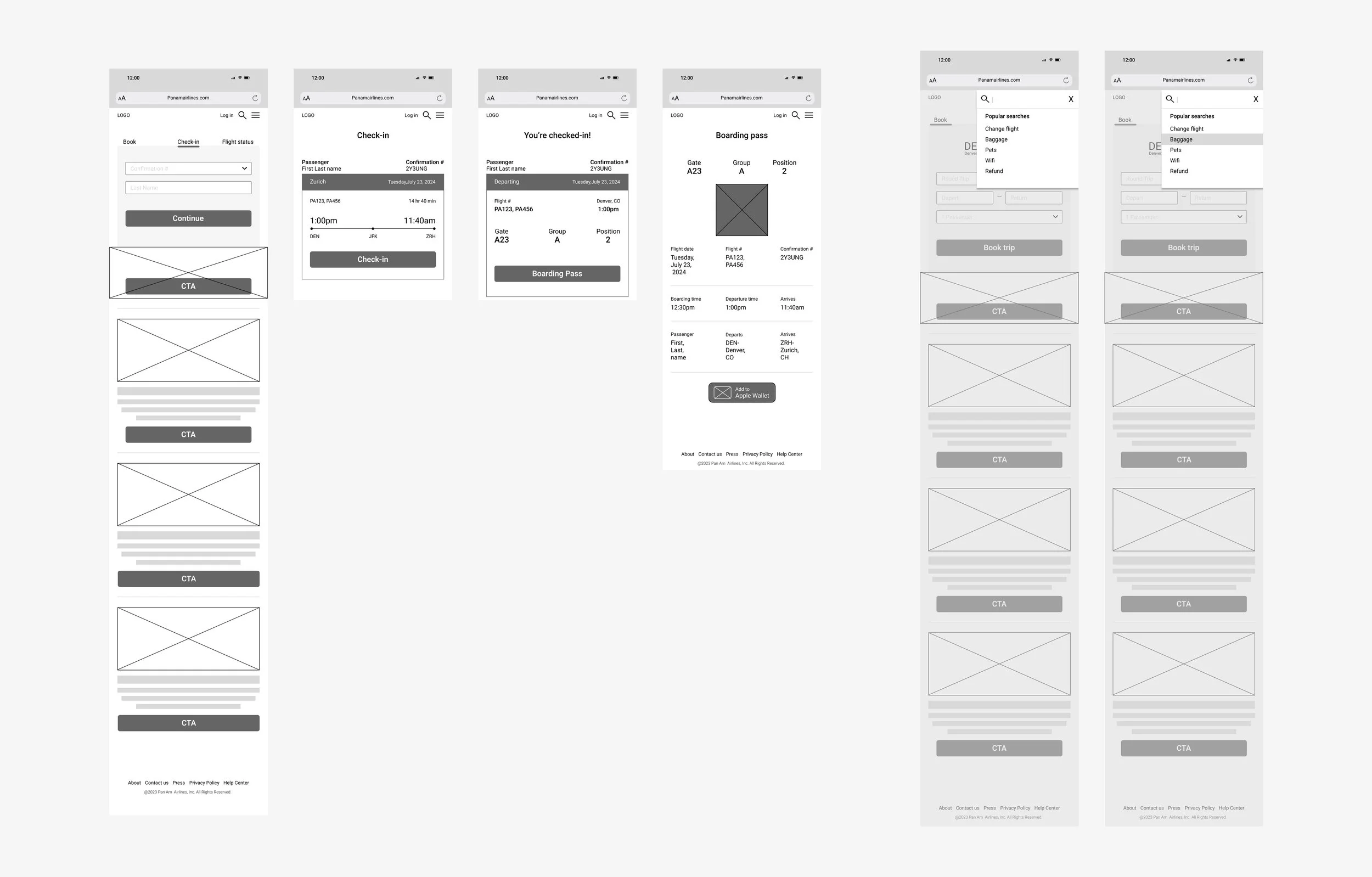
I iterated through various design versions, starting with sketches and then progressing to digital wireframes and high-fidelity wireframes. This process was incredibly rewarding as it allowed me to capture initial ideas and refine them into precise designs. Creating sketches and digital wireframes helped me seamlessly transition to the high-fidelity wireframe, bringing everything together cohesively.
Book Flight
Maximized Booking Access: Placed booking feature prominently on homepage, inspired by other airlines for easy access.
Simplified Selection: Split departure and return flight selection to separate pages for a clearer, less cluttered experience.
Streamlined Design: Separated summary and payment details for a cleaner, more efficient design.
Pan Am Airways Booking Flight
Check-in
Optimized check-in: Designed the check-in prominently on the homepage, modeling the approach of other airlines.
Search
Improved Search Accessibility: Added a prominent search icon to the homepage, mirroring other airlines for ease of use.
Enhanced User Guidance: Displayed "popular topic" suggestions for helpful options.
Pan Am Airways Check-in and Search
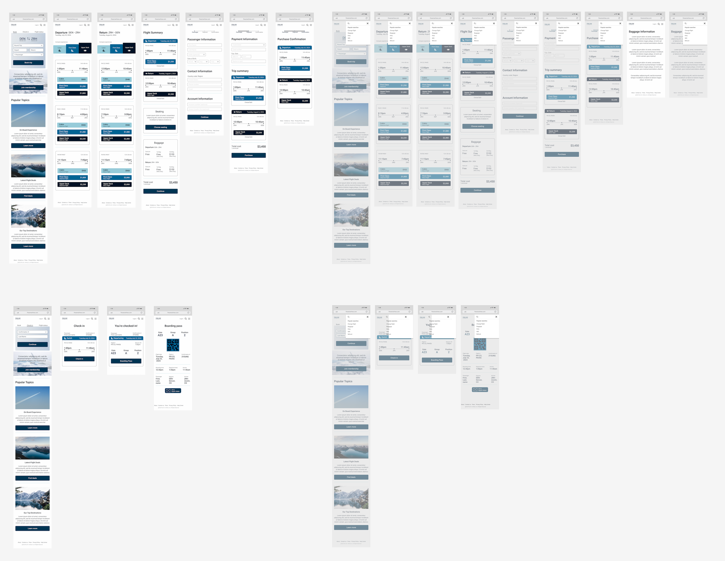
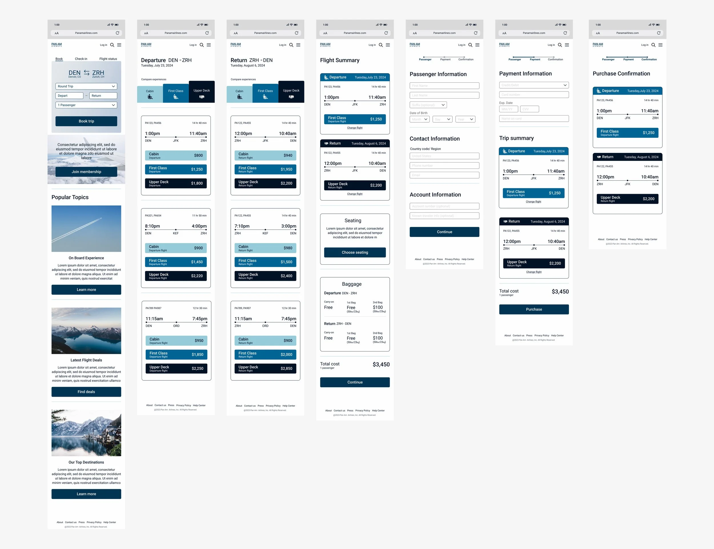
High- Fidelity Wireframe
By starting with sketching and then transitioning to a digital wireframe, and incorporating the branding, I was able to create a high-fidelity wireframe that embodies Pan Am's desired characteristics:
Professional
Modern
Premium
Elegant
Cool
Playful
Pan Am Airways High-Fidelity Wireframe
Branding
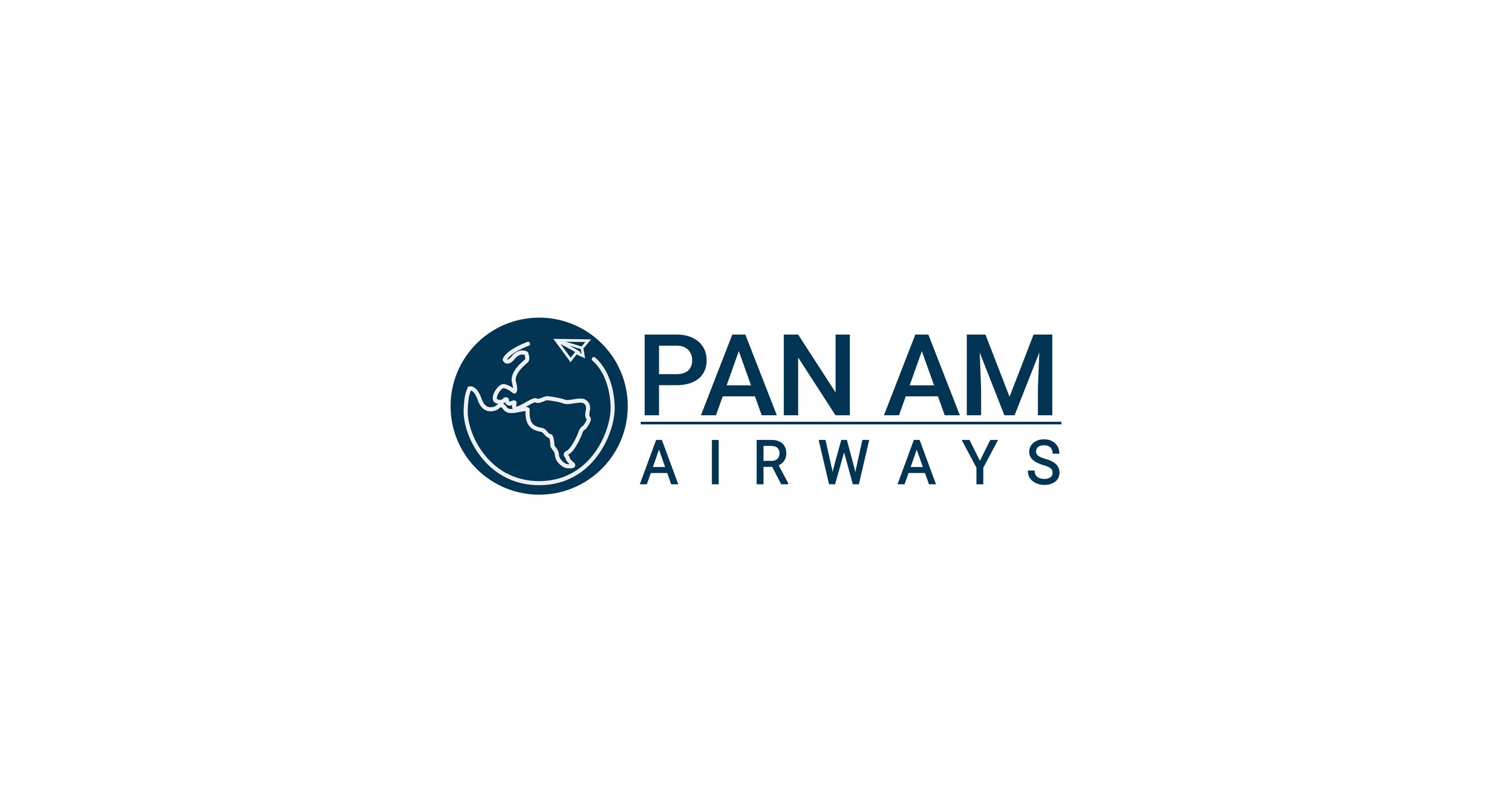
Pan Am, an established airline, sought a modern and dynamic redesign. I revamped the logo, preserving its globe symbol and blue color scheme while giving it a more contemporary appearance. Additional shades of blue were introduced to enhance its uniqueness and differentiate it from United Airlines.
Logo and Font
Opted for a darker blue logo to match Pan Am's professional, premium, and elegant goals.
Designed a paper airplane inside the globe, leaving a trail that forms the outline of the world map, to infuse the logo with a playful, adventurous spirit.
Selected the Roboto font for its straightforward design to maintain a professional and modern brand image.
Color Palette, Icons, and Buttons
Symbolized professionalism with darker blues and added a playful touch with lighter blues, aligning with Pan Am's goal of a professional yet playful image.
Included icons for each flight level to visually guide users, helping them make informed decisions during booking.
Opted for uniform button width and styling to enhance visual consistency and ensure they stand out effectively.
Cards
Selected a sky blue background for the 'Booking card' to create a soothing and inviting atmosphere, making the text fields and CTA button stand out to users.
Color-coded the flight buttons to match the flight experience levels selected by users, providing an additional visual cue of the differentiation.
Matched the top section of the flight summary card with the color of the chosen flight to provide extra confirmation of their selection.
Usability Test
Summary
Task 1: Book a flight.
All participants clicked on the “compare experience” tabs, thinking it would filter the flights.
⅗ of the participants said they would like more information on the “Purchase Confirmation” page such as e-ticket, confirmation code, and reassurance of their purchase.
Task 2: Check-in.
1 participant noted that users should have the ability to look at seat options after checking in.
1 pointed out that if there is a layover flight, there should be 2 flight boarding passes when checking in.
Task 3: Search baggage information.
⅗ participants didn’t gravitate towards the search icon initially but eventually figured it out.
Before Iteration
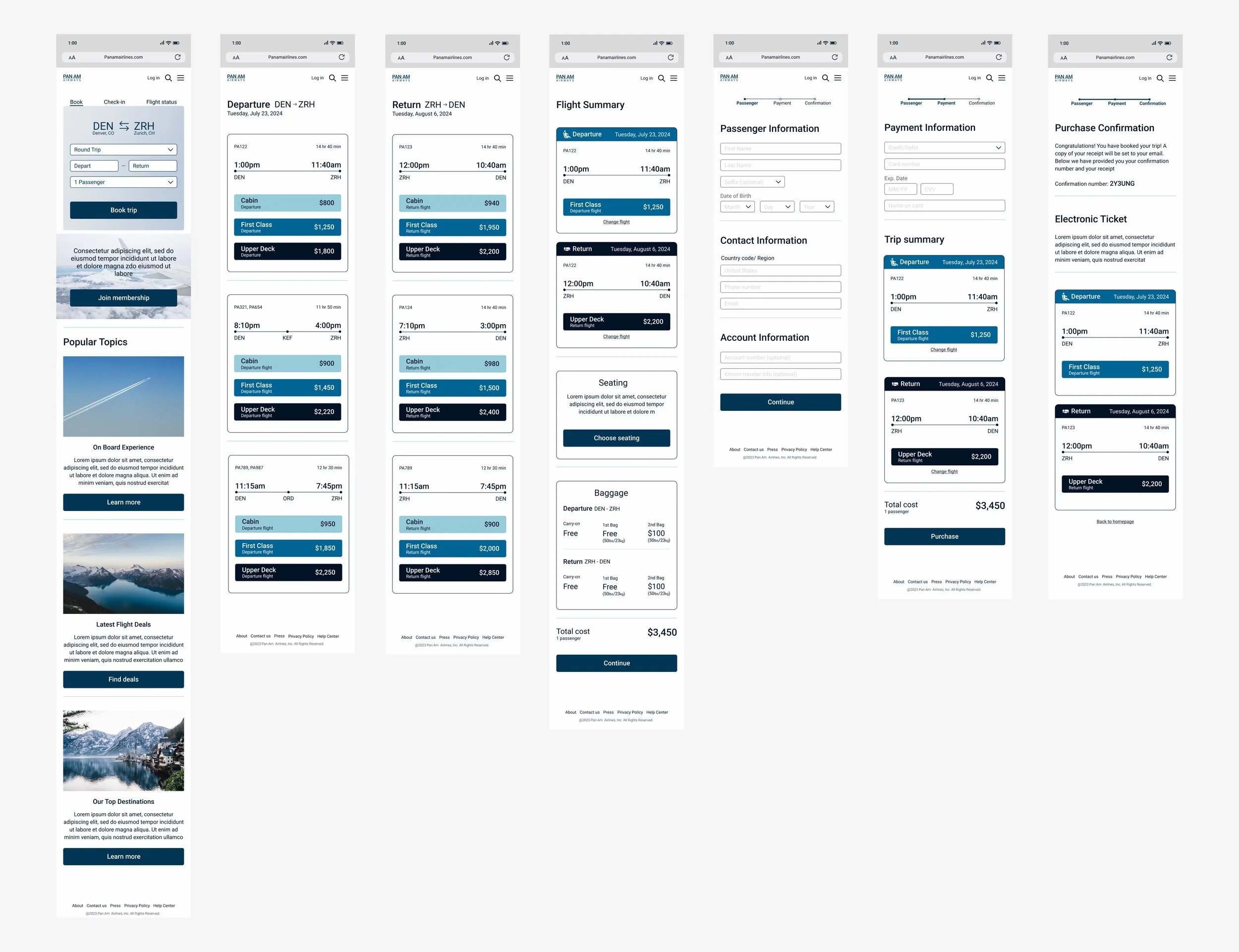
After Iterations
Prioritization
After conducting the usability test, I gathered a couple things I would like to change:
To avoid confusion: Remove the compare experience tabs since they cause confusion rather than be a helpful tool for users
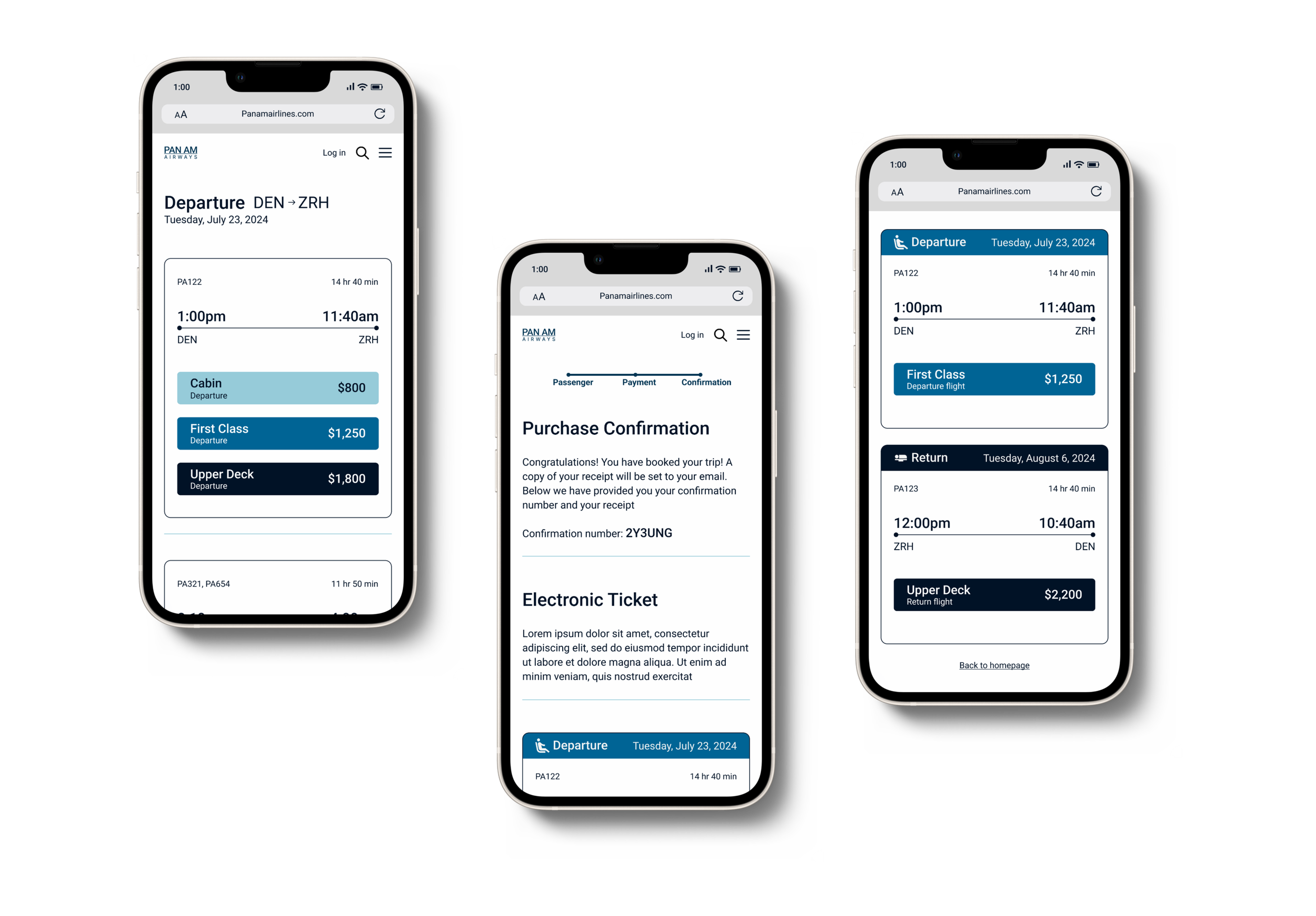
To indicate task completion: Add a confirmation message and e-ticket on the “Purchase Confirmation” page.
To allow continuity: Add a way back to the homepage or help direct the user elsewhere after the “confirmation purchase” page.
