SimpleMove
A mobile-first, responsive website for people moving to a new place.
Role
UX/UI Designer
Project Timeline
3 months
Project Overview
Project Goal: Design a responsive website for people dealing with a move.
User: People who want to stay organized during a move.
User Problem: Individuals feel stressed and disorganized during a move.
Business Goal: Keep customers organized and engaged during their move.
Solution: Create a product that helps movers stay organized and on track during their move.
Discover
Interviews
Desk Research
Competitive Analysis
Define
Personas
HMW
Ideate
Sitemap
Wireframes
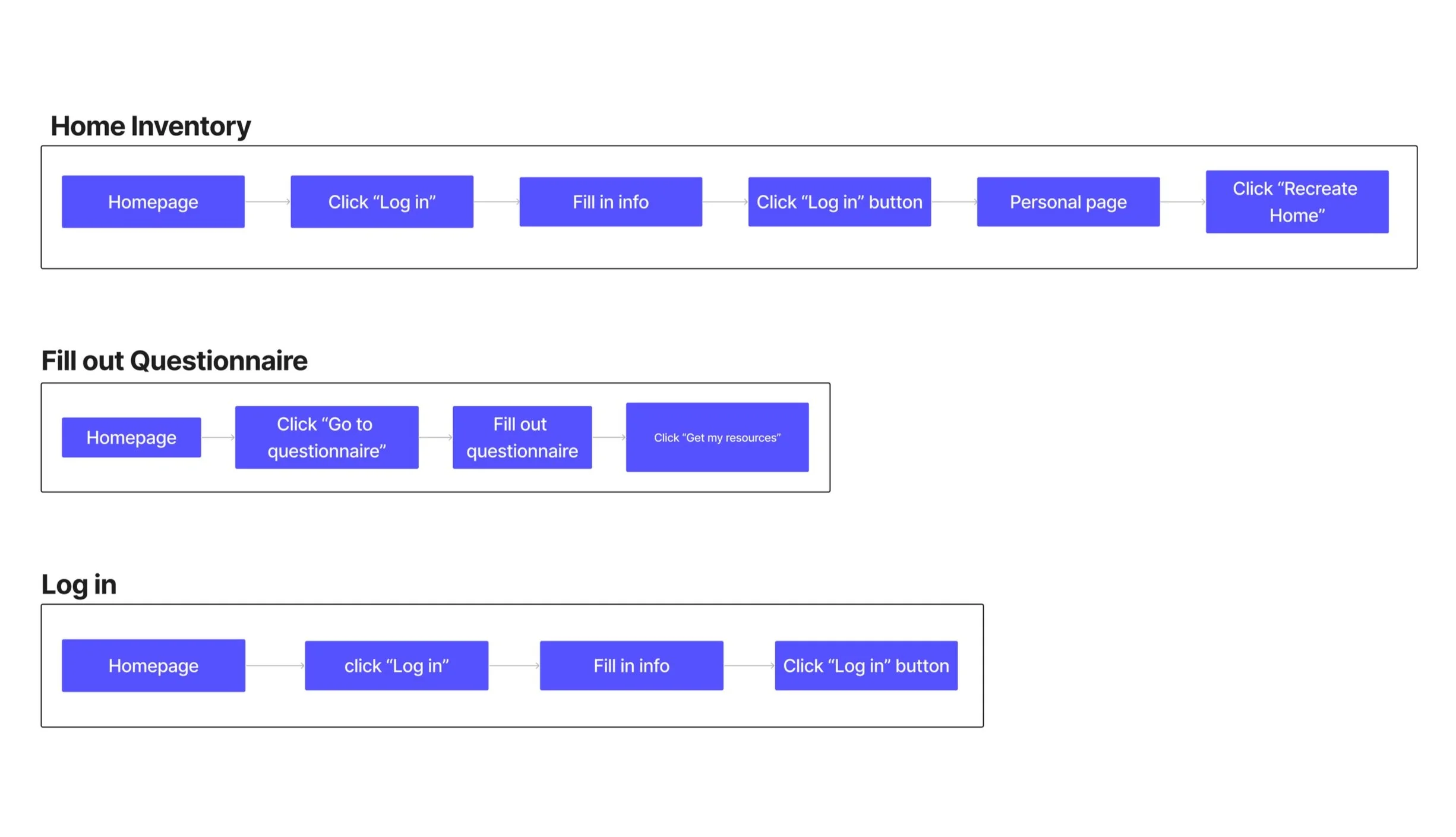
Task Flows
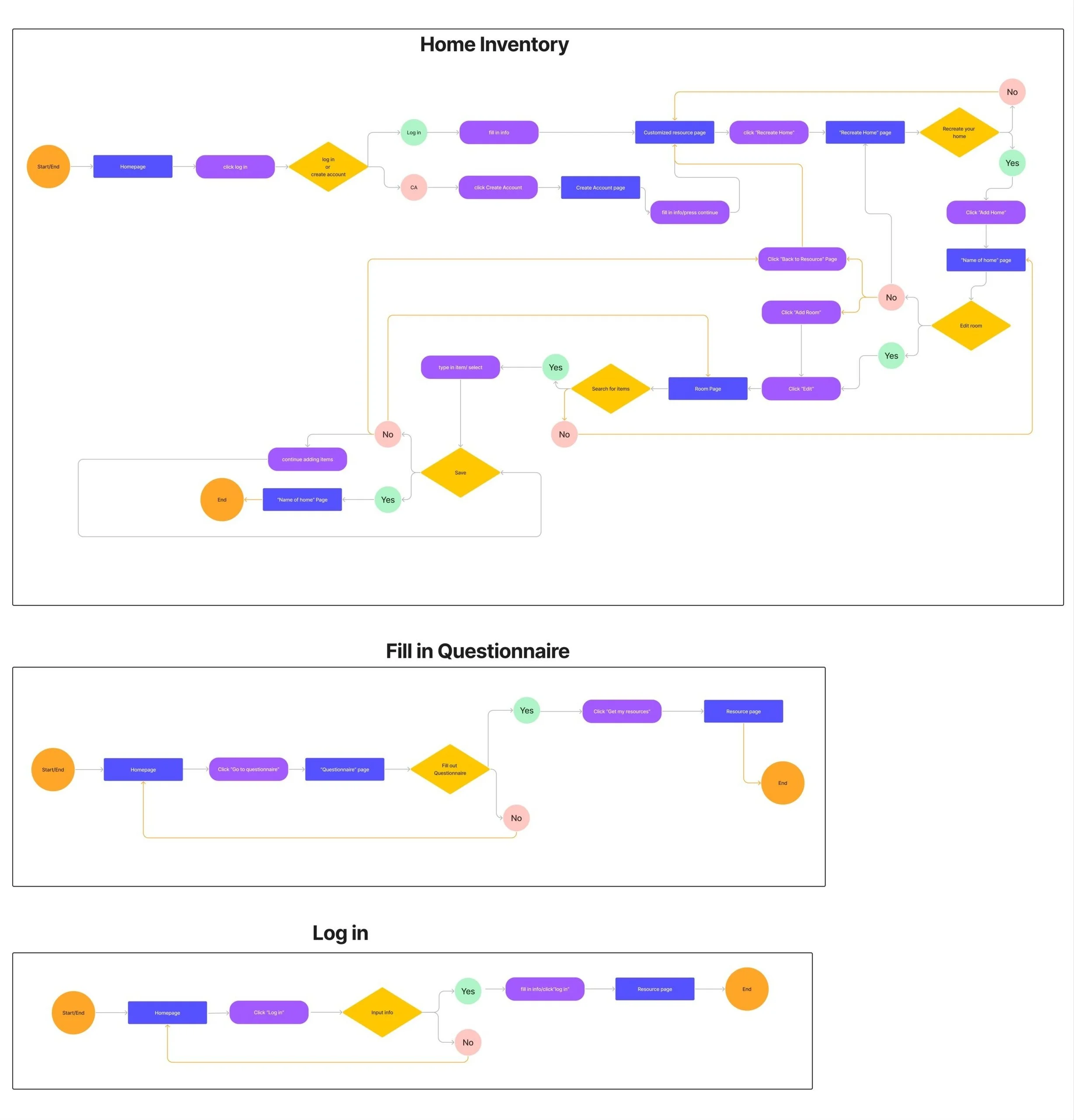
User Flows
Deliver
Prototype
Usability Testing
Analyzing and Prioritizing
Iterations
Competitive Analysis
For my first project, I chose to focus on "moving to a new place" because it's a universal experience that almost everyone will encounter at some point, making it a relatable and relevant topic.
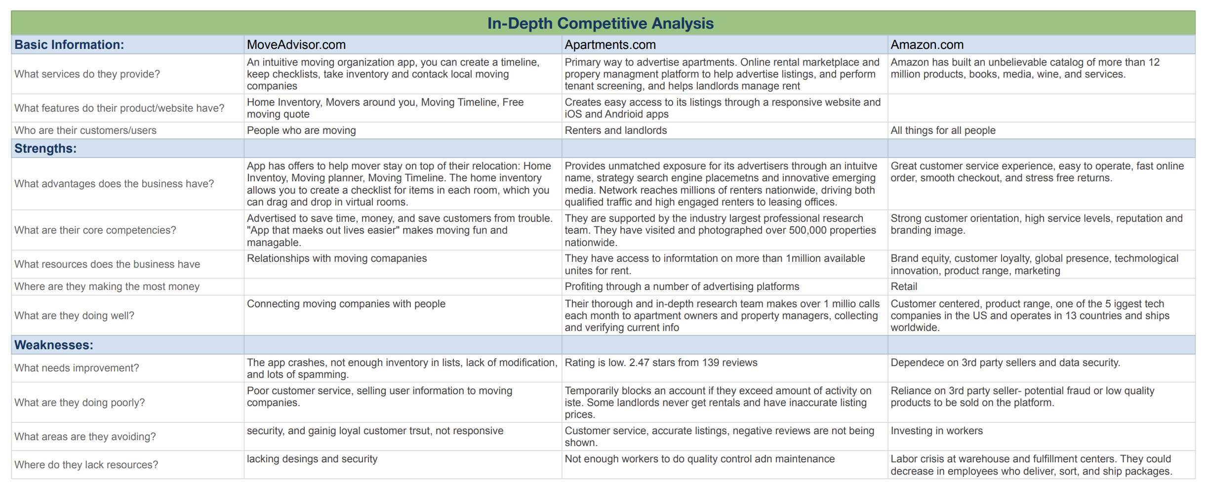
I started the project by doing a competitive analysis, examining MoveAdvisor (focused on moving), Apartments.com (focused on housing), and the successful and well-known Amazon to understand their services, strengths, and weaknesses. This research provided valuable insights into customer perceptions and offerings in the market.
MoveAdvisor
Features: Moving organization app features customizable timeline, checklists, inventory management, local movers directory, and free moving quotes, simplifying the moving process.
Strengths: Offers features to streamline moving. Marketed as a time and money-saving tool, it aims to simplify moving and connects users and moving companies.
Weaknesses: Frequently crashes, has limited inventory lists, lacks modification options, and suffers from spam. It also has poor customer service, is accused of selling user information, lacks responsive design, and struggles to gain loyal customers.
Apartments.com
Features: Online rental marketplace and property management platform serves as the primary advertising avenue for apartments, offering tenant screening and rent management, benefiting both renters and landlords.
Strengths: Provides advertisers with prime exposure in the rental market, driving qualified traffic to leasing offices. Supported by a large research team, they verify information through over 1 million monthly calls.
Weaknesses: The app's low 2.47-star rating is due to complaints about temporary account blocks, inaccurate listing prices, unavailability of rentals, poor customer service, and lack of quality control.
Amazon
Features: Amazon offers an unparalleled selection of over 12 million products, spanning books, media, wine, and services, striving to cater to the diverse needs of all consumers.
Strengths: Known for its excellent customer service, smooth online ordering, and stress-free returns. With a strong brand image and global presence, it's one of the top tech companies in the US, operating in 13 countries and shipping worldwide.
Weaknesses: Amazon's reliance on third-party sellers raises concerns about data security and fraud. Additionally, there's a labor crisis at their warehouses and fulfillment centers, with predictions of running low on employees for delivery and shipping.
Interviews
After completing my competitive analysis, I conducted interviews to gain a deeper understanding of the challenges faced by movers. This approach aimed to propel my project forward by uncovering specific issues I could address to benefit movers.
6 participants, male and female, 20-30 year olds
“I feel exhausted and anxious about the move going smoothly and having to do research.”
“I feel overwhelmed, disorganized, and it feels never ending.”
“I feel stressed about everything! There is a lot to plan and think through.”
“I view my move as a success if there is no unexpected event or costs occurring.”
Personas
Creating the Personas help me understand the user's goals, motivations, needs, and frustrations.
HMW
After my findings from the interviews, I would like to explore ways to help movers find solutions to keep organized during a move so that they don't feel disorganized or get exhausted from the mental load.
How might we help reduce movers mental load?
How might we help movers feel more organized?
Ideate
Creating sitemaps, task flows, and user flows was instrumental in designing a more user-friendly and intuitive product, ensuring that user needs were effectively met.
Task flows helped me choose the important pages and goals for my website.
User flow helped me view my project from a users perspective. This helped me trace the steps and decisions that users would encounter while using the product.
Sitemaps helped me focus on the skeleton of the primary and secondary pages that I wanted on my website.
Design
Low-Fidelity Wireframe
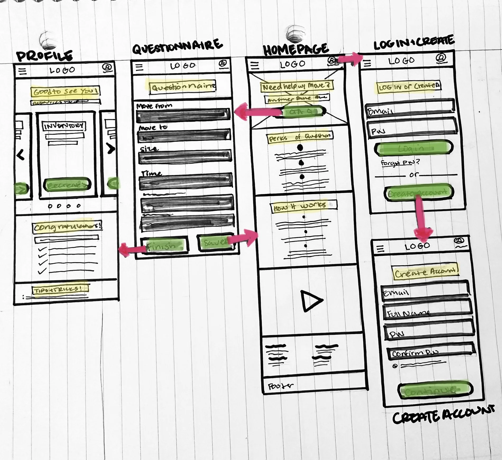
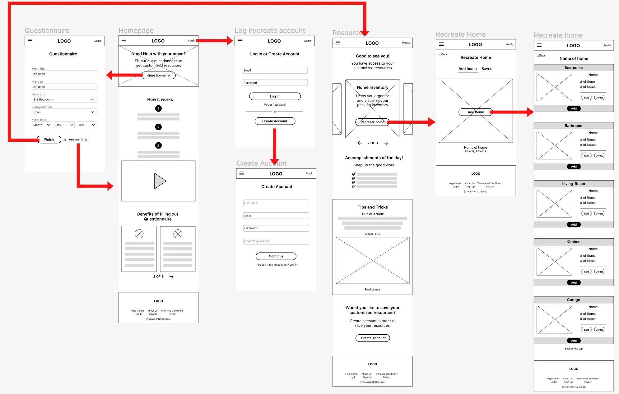
Starting off with a low-fidelity project allowed me to jot my ideas down on paper so that I could see what worked and what didn’t.
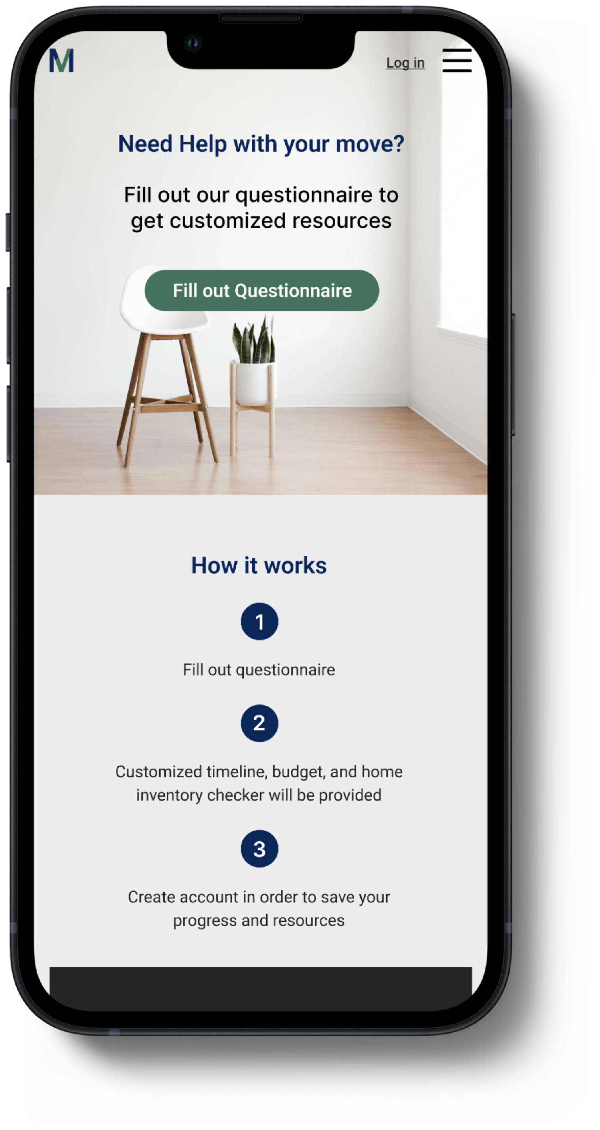
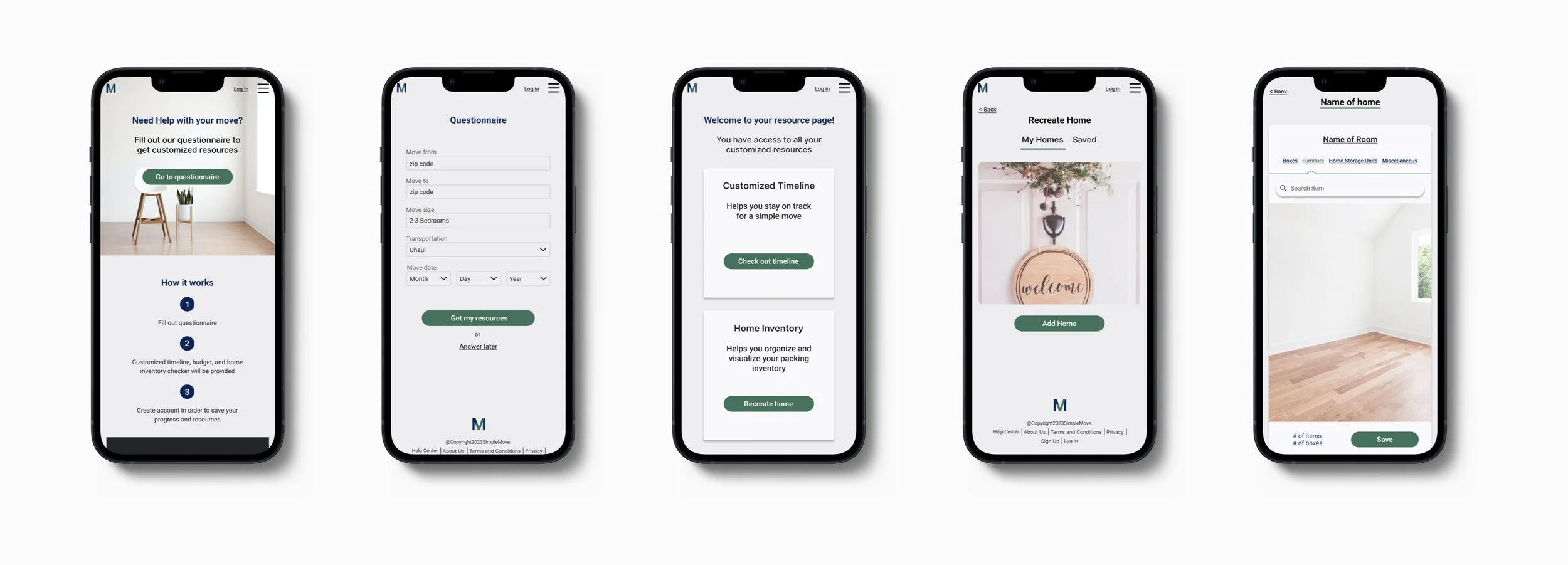
Homepage: Provides an overview of SimpleMove's services, perks, and how it works, with access to the questionnaire.
Questionnaire: Allows movers to input information for personalized tips and tricks to prepare for a successful move.
Profile: After creating an account, movers can access personalized resources, tips, and save their account activity for record and organization purposes.
SimpleMove Low-Fidelity Wireframe
Digital Wireframe
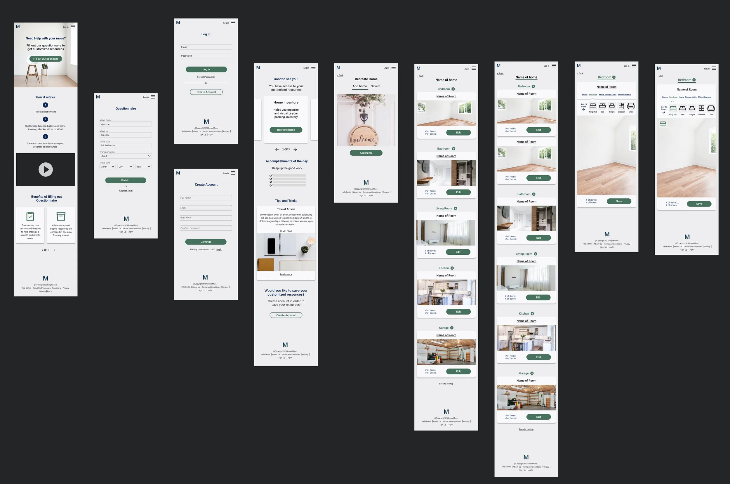
Digitizing my project was a helpful way for me to see how my idea would translate on screen and using grids made my projects come out more precise, clean, and consistent.
Log in/Create Account: Movers can choose to log in or create an account.
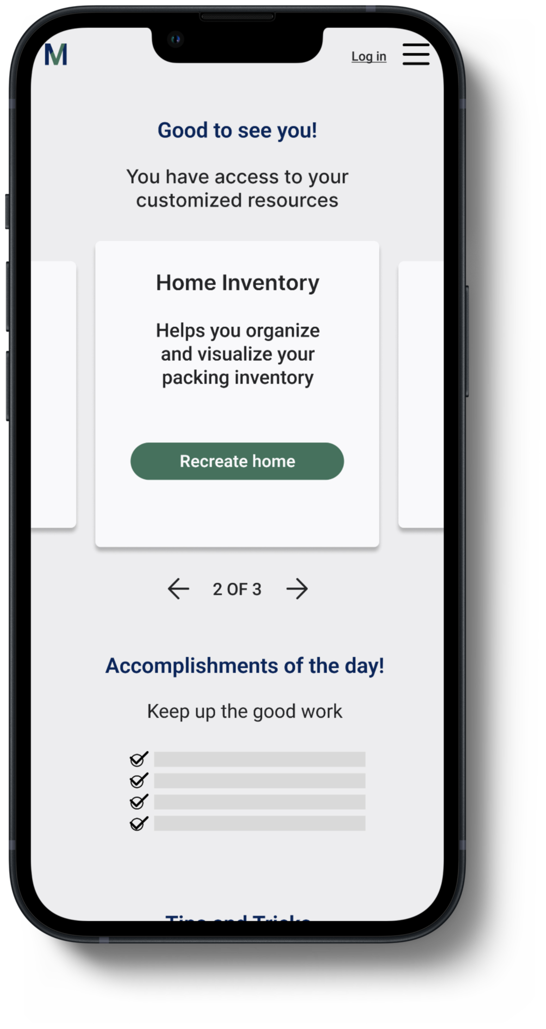
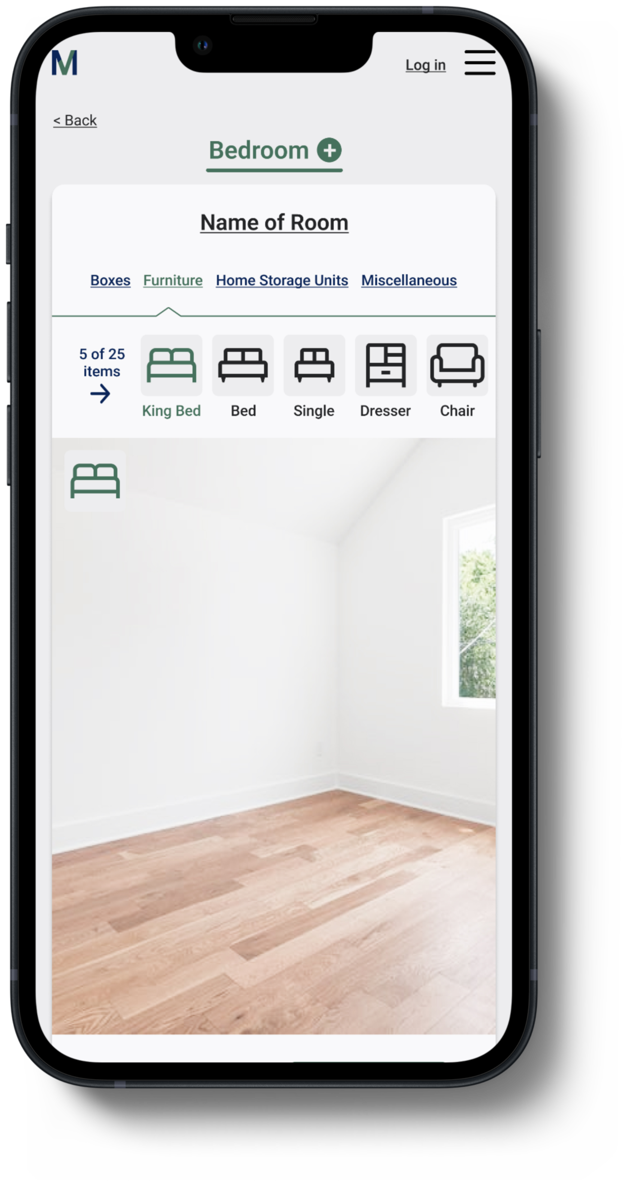
Home Inventory: A section to help movers stay organized by documenting their inventory based on rooms.
Daily Accomplishments: A section that displays the tasks movers have completed each day.
SimpleMove Digital Wireframe
Hight-Fidelity Wireframe
After defining SimpleMoves' core brand values, I implemented them across all wireframes to develop the high-fidelity wireframe.
Branding
Company message
Simple- We strive to make everyones’ move to a new place simple.
Guidance- We provide guidance for people moving to a new place so that they don’t feel overwhelmed by the daunting tasks.
Resourcefulness- We hope to give customers resources that is beneficial and specific to making their move as streamline as possible.
Harmonious - We want our customers to have a pleasant experience and feel at ease when using our products.
Fresh- Moving to a new place can feel like a fresh start, a sigh of relief, that is what customers should feel when they navigate and use our website.
Logo
In designing the logo, I prioritized a name that is clear and easy to recall. I integrated a checkmark into the standalone "M" and utilized the checkmark as a substitute for the "v" in "SimpleMove."
Color palette and typography
I wanted a minimalistic website for users who are in a rush and need to accomplish a task quickly.
Green: represents growth, positivity, and freshness.
Blue: represents trustworthiness and professionalism.
San serifs: to convey professionalism and straightforwardness.
Buttons and Icons
Buttons: Designed in green to indicate action and stand out on the website for easy visibility and quick interaction.
Icons: Used to provide additional indication and visual cues, enhancing user understanding and interaction.
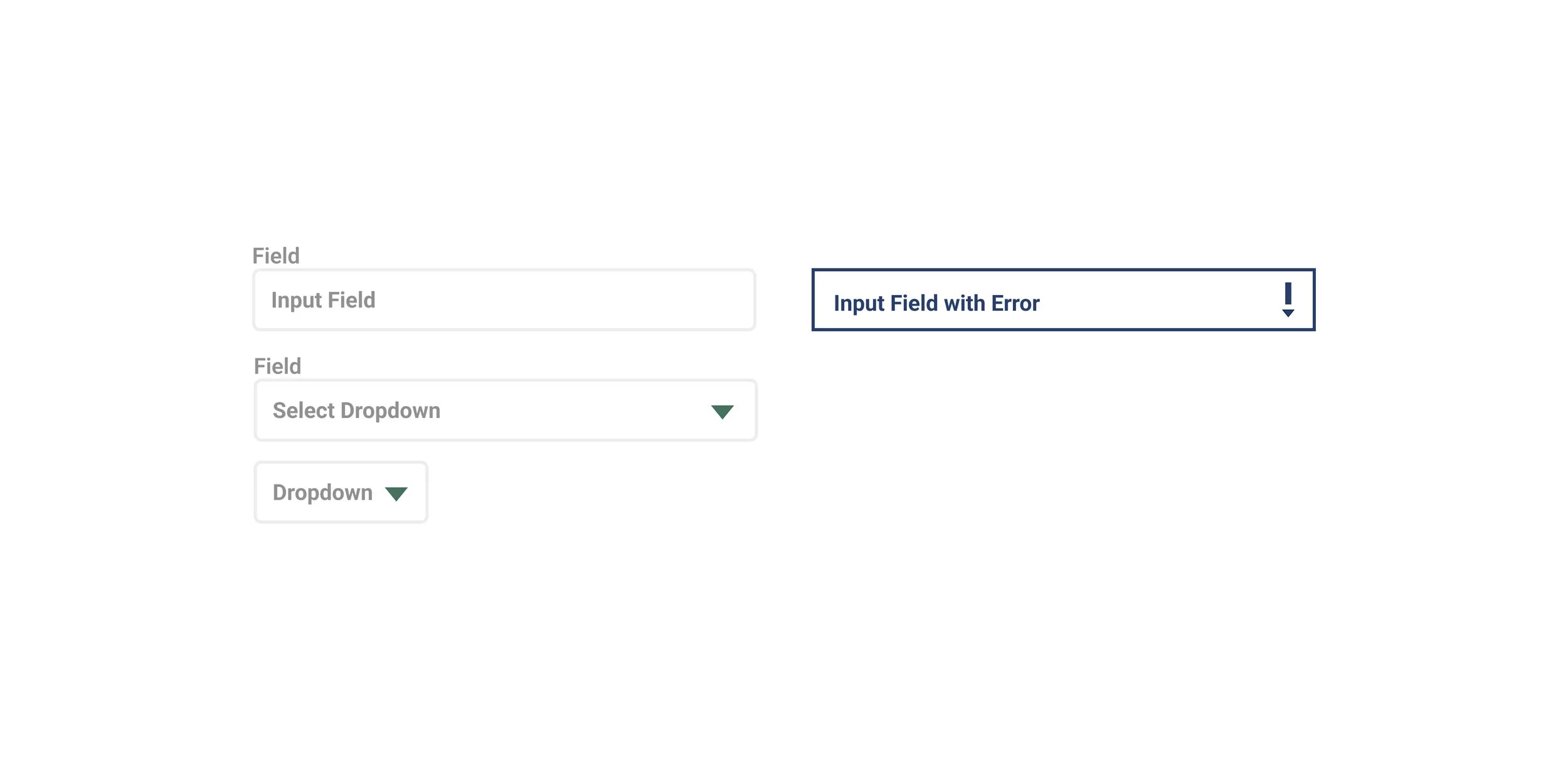
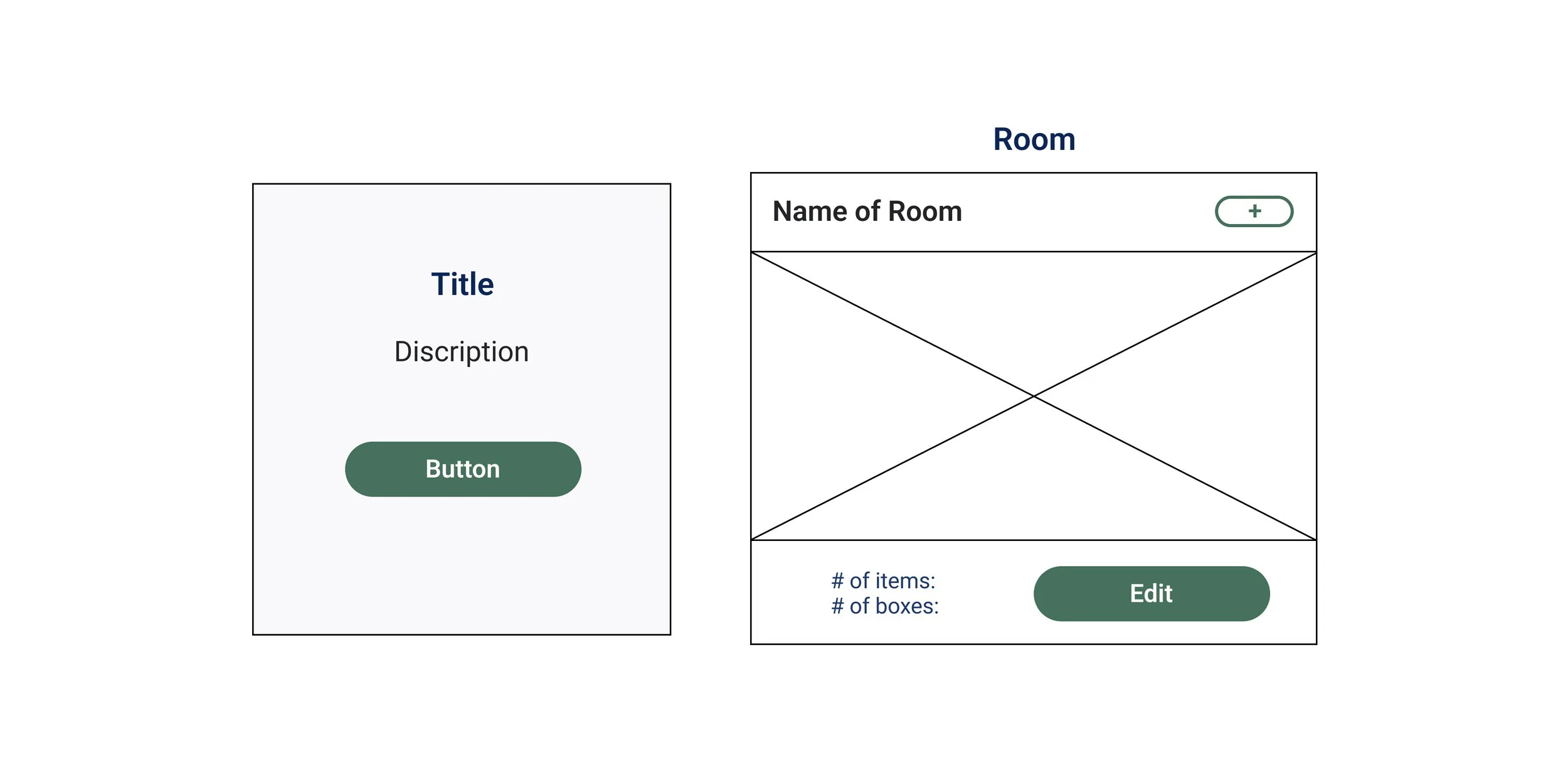
Form Fields and Cards
Form Fields: Employed for the questionnaire and login sections.
Resource Card: Offers detailed descriptions of available resources and provides access to them.
Room Inventory Card: Allows users to log the items packed in each room, including the number of boxes and items, along with the room's name.
Usability Test
Summary
Task 1: Click on CTA to fill out questionnaire.
All 5 participants were confused about the CTA button, but still managed to accomplish the task.
Task 2: Check out Home Inventory.
⅘ participants were confused by what home inventory meant.
⅘ participants preferred to have resources displayed instead of in a carousel.
Task 3: Add a room.
Unanimously everyone's favorite page, they liked the simplicity.
Task 4: Add a King bed.
All 5 participants had suggestions to make it clearer.
⅘ participants didn’t like the idea of scrolling through icons.
⅘ participants preferred searching for a specific item, rather than endlessly scrolling and potentially not having their item.
Task 5: Create an Account.
⅘ participants thought the ‘Save’ button indicated their progress was saved, but didn’t realize they needed to take an extra step to create an account in order to have their progress permanently saved.
Inventory
Homepage
Profile
Prioritization
Enhance user guidance: Updated the homepage CTA to "Go to Questionnaire."
Improve accessibility: Switched from a resources carousel to individual cards.
Facilitate user action: Added a "Create Account" CTA after saving progress on creating a home page.
Optimized item search: Replaced the editing section with a search bar.
Clarify user status: Updated the "Log in" button to "Username" post-account creation and login
